Website Buroform – Stories category

The ‘paper listener’: ‘Sometimes I flip through a book just to hear what paper it is’

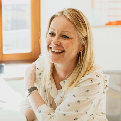
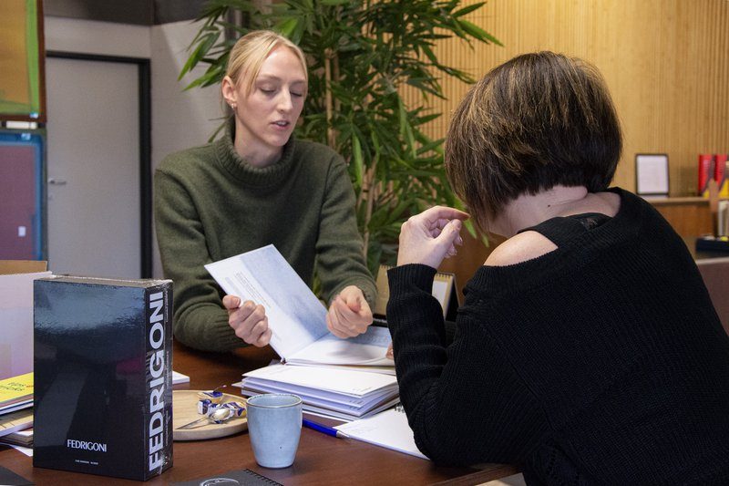
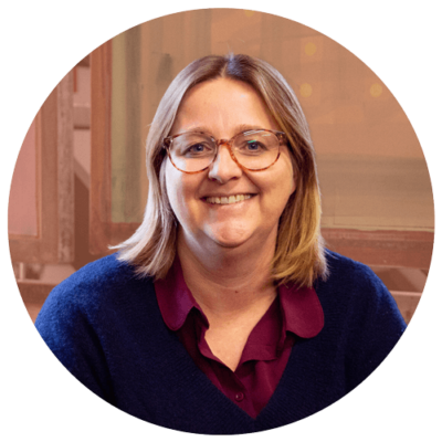
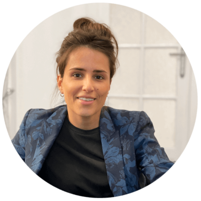
Some colleagues call her “the paper doctor,” because of her unpublished expertise. Other “madame caps,” because she consistently types in capital letters. After all, as a multitasker, she has no time to waste, especially on spelling and punctuation. Drive and enthusiasm are perhaps the two terms that best characterize Katrien Maes. On top of being a barrel of energy, Ghent is an encyclopedia of knowledge about paper, printing techniques and finishes. Under the Fedrigoni banner, she will supervise several of our breakfast sessions in the coming months. High time, then, to give her an interview on our website!

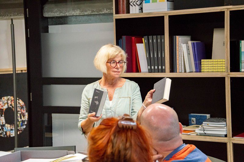
There are few people who speak about paper with as much abandon as Katrien Maes. For her, paper is much more than a craft. It is a passion she lives in a special way. ‘It happens that I flip through a book or catalog, just to listen to the paper. To hear what type and grammage it’s about,” she smiles. Paper has a touch, but for Katrien it also has a specific sound. It says everything about how she handles the product. Since 2019, she has been working at Fedrigoni, one of the world’s most renowned paper manufacturers. There she forms the advisory link between designer, printer and end customer. A connecting figure, who takes projects to the next level with exceptional feeling. “I can empathize with what others are feeling or thinking,” she says. ‘That is probably my greatest strength: putting myself in the customer’s head. What exactly does he or she need? Which paper fits best with the concept, with the brand identity and company philosophy? People have a certain result in mind. They dream about something. I respond to that. Printed matter is customized. It has to seamlessly translate what you stand for as an entrepreneur or company, and that starts with the paper.’

“It happens that I flip through a book or catalog just to listen to the paper. To hear what type and grammage it is about”

Mini models made of paper

Katrien was born and raised in the printing industry. Her father founded Guido Maes.Printingdeluxe in 1965 in Ghent. As a child, she helped in the print shop at a young age, later directing the business herself for 25 years with her sister Lieve. ‘Our strength lay in total guidance. Concept, choice of paper, design, format, finishing method, you name it. We took care of the whole workflow, from beginning to end. I always wanted to know the full story. That’s still true today. The right paper is crucial to the feel of your printing, but it remains one facet within a large process.’
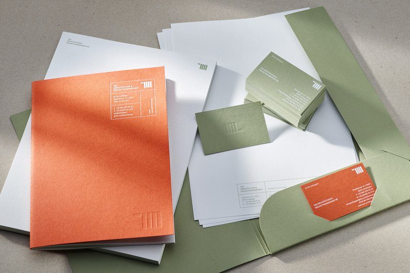
Award-winning corporate identity for TAO Architecture using paper from the Materica collection.

In addition to being a printer, Katrine’s father was a graphic designer. Tryouts that ended up in the trash, she picked up and turned them into booklets. ‘Mini maquettes,’ she says. ‘An advance copy for later. When Lieve and I ran the print shop, we had a loft above the studio. Customers came by there with their idea. That same day they stepped outside with a blank dummy of their future realization. At Fedrigoni, I still do that. Each proposal is accompanied by a model. This allows clients to experience the effect of the paper in real life beforehand. They discover what it looks like, what feeling it has, how the pages fall open… Nowadays everything is digital, but you can’t experience printed matter through a pdf. You have to go back to the material.’

Most comprehensive paper collection

Fedrigoni’s assortment includes some 2,500 papers. “It is the most beautiful and comprehensive collection there is,” Katrien said. ‘The materials are of the very best quality and in terms of applications there are simply no limitations. Everything has been thought about. Each paper has a unique name and its own story. And then that Italian, I love it. It provides an extra dimension, a kind of romance.’

“Each paper has a unique name and its own story. And then that Italian, I love it. It adds an extra dimension, a kind of romance.”

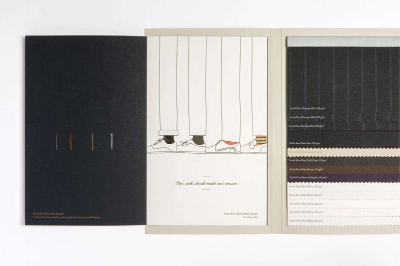
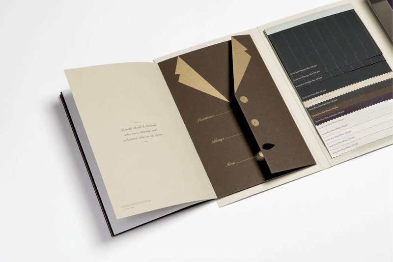
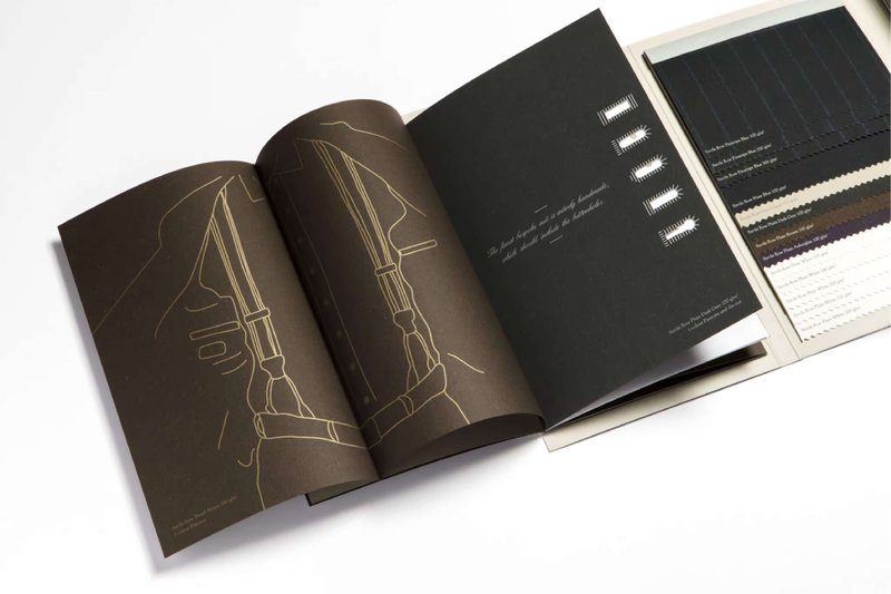
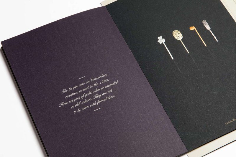
Whether she has a favorite paper herself? ‘There are so many beautiful papers, but if I had to name one it would still be Savile Row. Because it has a special meaning for me. My grandfather was a tailor and has had a big influence on who I am. Savile Row is made from recycled clothing. Very special, and a great example of the sustainability philosophy at Fedrigoni. We invest very hard in that. The Platinum Label from EcoVadis is the best proof of that.’

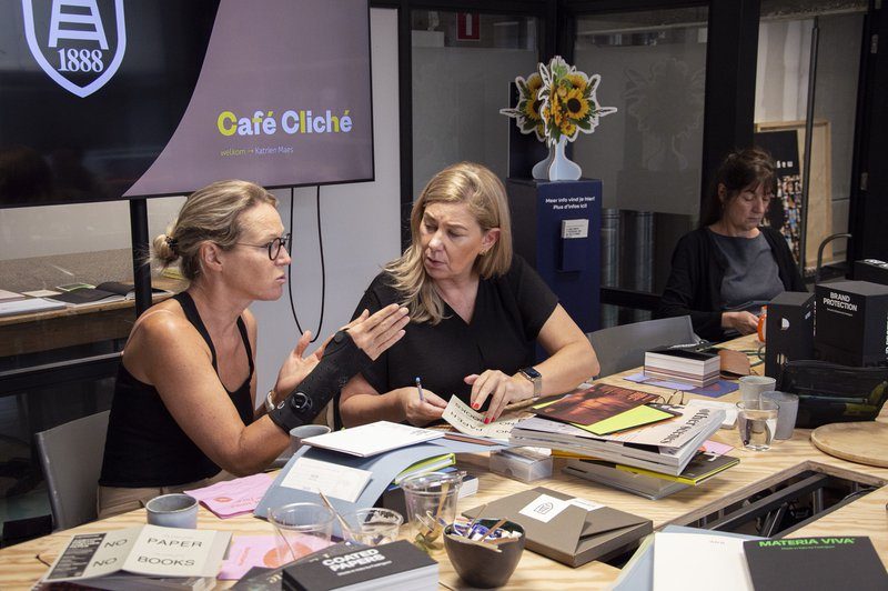
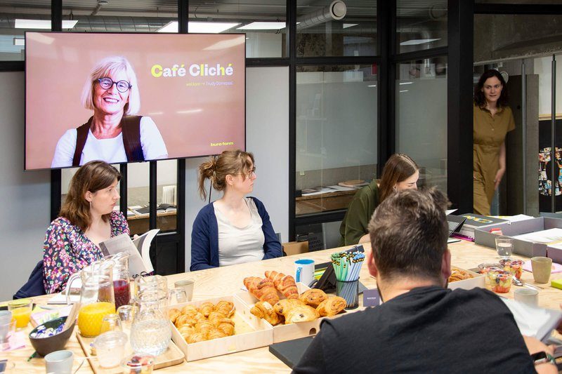
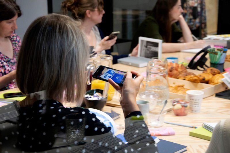
Katrien Maes is ready to inspire you at another breakfast session. Prepare for an engaging session where Katrien will enchant you with her expertise and impressive knowledge, representing Fedrigoni. Registration is available on the Café Cliché website .

Pioneering book design: meet Trudy Dorrepaal

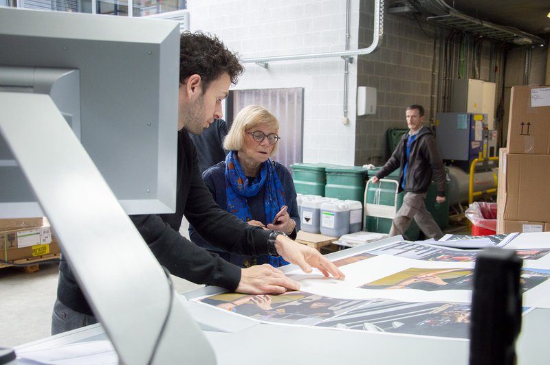
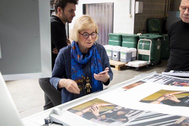
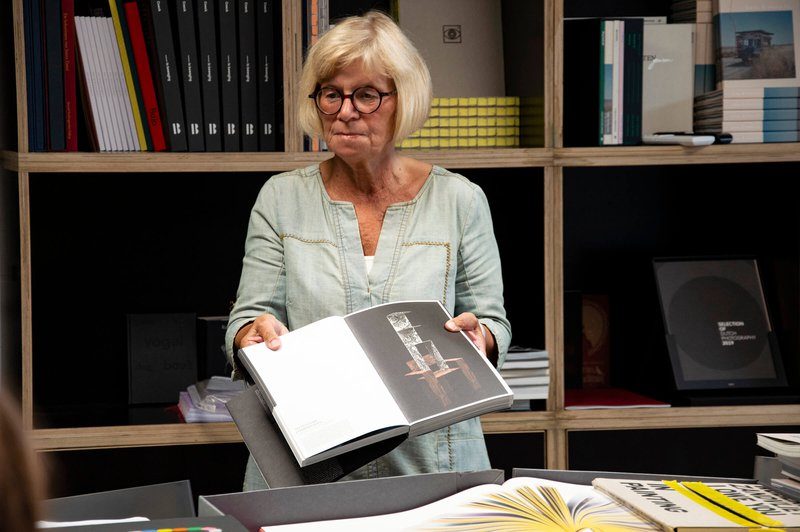
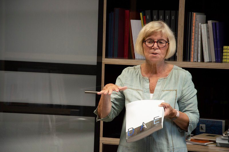
You have books about art, but also books that are so meticulously finished that they are almost art. That second category includes just about everything that has passed through Trudy Dorrepaal’s hands. As a book consultant, she is second to none. Even now past retirement age, she remains the absolute reference in Belgium and the Netherlands in the field of book printing.
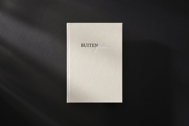
Register for the breakfast session with Trudy Dorrepaal on Nov. 9

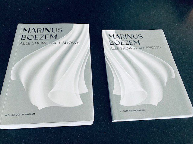
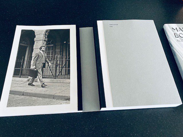
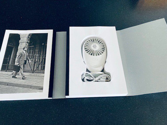
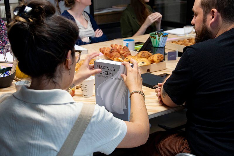
Under her watchful eye, the most wondrous graphic works were created in recent decades. Books made so extraordinary that they stand miles above the ordinary printed matter. Consider the “fan book” All Shows by artist Marinus Boezem, which effectively incorporates a physical fan. Or Mad of Surrealism for Museum Boijmans Van Beuningen: an exhibition catalog, conceived as a cassette with vistas into the collections and inside is made up of four collectors’ houses. They are gems of delicate beauty and tactility, betraying an exceptional love for the craft. Trudy’s knowledge of paper, lithography, printing and binding techniques is rare, as is her eye for detail and perfection. The fact that she recently started knocking on our print shop makes us rejoice with pride. We could hardly imagine a nicer compliment.

Hello Trudy, books so. How did you actually end up in “our” world?

‘Do you have a moment? (laughs) That’s a long story. I’ve always had a passion for art. As a teenager, I wanted to attend the Gerrit Rietveld Academy in Amsterdam. But my father said “no. ‘Art, you can’t make a living at that, can you?’ Eventually, I became a kindergarten teacher first. Afterwards, I got into travel and hospitality before starting to work for a cartographer. That’s where I took my first steps in the printing industry. Among other things, I dealt with special custom printing for customers there. From there it all happened quickly. At Proost and Brandt, I ended up in the paper. I worked there for five and a half years and immersed myself completely. After a while I was allowed to give presentations in print shops and schools. For the past seventeen years, I have subsequently worked for some of the leading printing companies in the Netherlands. First at Lecturis. When they went bankrupt, I started my own ArtLibro. In that capacity, I was successively associated with Roelofs Printing Company and then Coers & Roest. I often did crazy projects there. Things that no one thought were realizable, but which I then latched onto. If it had to be really special, people would come to me. That’s pretty much become my trademark.’

Indeed, the books you collaborate on are rarely ordinary. What makes designers and artists come to you when it really needs to be special?

‘You would have to ask them that, of course. (laughs) No, I’ve built up some credit over the years, of course. I have the insight to get certain things done anyway. But above all, I am also very fanatical. High-quality printing listens very closely. The smallest detail must be perfect: the type of paper, the layout, specific color nuances, the quality of the printing ink, and so on. I really put my soul into a book.

Is that Trudy Dorrepaal’s secret: passion?

‘I think so. Passion and perfectionism, perhaps. I rarely make it easy on myself because I assume that anything is possible. Even if a client or printer has no faith in the feasibility of a project, I persevere until I find it. I know what can be done and how to do it. And if I don’t know, I figure it out until I find a solution. Often this results in fantastic collaborations; sometimes it clashes. But I don’t need to be liked, I just go for it. Take the book Crazy of Surrealism for the Museum Boijmans Van Beuningen. This was created in the form of a cassette with vistas into the collections of four private collections. The book itself is composed of four collector’s houses, each with its own atmosphere and character, translated into different types and sizes of paper. All of the works on display are depicted in those houses. As a reader, it is as if you are invited into the collectors’ homes. Well, things like that, real challenges, I just like doing that.’

But you can’t do it alone, either. Your network spans specialists from all over the world. How important are they?

‘You can’t deliver quality without surrounding yourself with passionate professionals. Designers, publishers, shapers, bookbinders, papermakers and, of course, talented and motivated printers. Without them it doesn’t work.

So what makes a good printer for you?

‘A book is like a baby, you should be able to be proud of it. It needs attention and love. I am looking for printers who exude the same enthusiasm as I do. For me, a good print shop consists first and foremost of passionate people who are involved from start to finish. And, of course, a good lithographer is also incredibly important. You have to be able to mold every detail into a compelling whole. And you have to have a feel for it and be able to work with different grids.

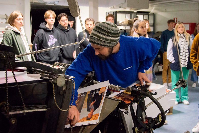
Printer Sven in action for cosmetics brand Ellis Faas’ book.

How did you actually end up at Buroform?

‘When I worked for ArtLibro, I was attached to a regular producer. In this way, I was able to immerse myself in wonderful projects. Since 2022, I have been working completely independently, making me freer to enter into collaborations. I want to give my clients total creative freedom. It opens up new possibilities, for the people who want to work with me, but also for myself. One day I got a call from your manager Jesse to have a chat. He had seen the book Straight-Line Leadership, which I shrugged off. I was immediately impressed by his enthusiasm. He is enormously passionate about his craft. I find that attitude in general at Buroform: going for it, with dedication, with passion. We recently completed our first collaboration: the book for Ellis Faas, a Dutch cosmetics brand. Today I work with several printing companies, in the Netherlands and Italy. I choose according to the project. But coming to Belgium, for me it’s Buroform. That’s where the bar is highest, as far as I’m concerned.

You also provide training and workshops. Soon we will also invite you as a speaker at our first breakfast session. Do you enjoy sharing your knowledge?

‘I have taught workshops and courses for many years to companies, universities, schools and academies, among others. Today I’m a little more selective about that, but I still find it very inspiring to do. I enjoy getting young people excited. To show graphic designers what is possible. You have to feel and experience a book. During such a workshop, I take people completely into the story behind certain books.’

View the program of the following breakfast sessions

You have been past retirement age for a while and yet you keep going. Where do you keep getting that energy?

‘I just enjoy doing it too much still: helping designers, mentoring young people. I have accumulated so much knowledge. It would be a shame to let those suddenly go to waste. I am open to all great projects, small and large, with or without a printer. People can hire me for full guidance during the design and printing process, or just for advice. Of course I sometimes think about doing something else, but art and books remain my first love. You stay attached to that.

On Nov. 9, we will host another breakfast session with Trudy Dorrepaal. Register soon: https://www.cafecliche.be/evenementen/2023/ontbijtsessie-09-11-2023/

How does the ROI of a print campaign score?

In a world where online ads dominate, it is easy to write off print advertising as old-fashioned and ineffective. But what if we told you that print can still make a big impact and deliver an impressive ROI (Return on Investment)? According to research conducted by NDP News Media and GfK, it appears that print advertising, such as ads in newspapers and magazines, is still a powerful means of reaching consumers and achieving results. Let’s look at the findings and discover why print still deserves a place in the modern advertising landscape.

Daily newspapers and magazines: ROI Champions

The research shows that both dailies and magazines achieve impressive ROI figures. Advertisements in daily newspapers score an ROI as high as 120%. In other words, every euro advertisers spend on daily newspaper ads yields an average of €1.20. This means that the placement costs of the ads are already more than recouped within the campaign period. Magazines do even better with an ROI of 130%. Despite the lower reach of magazines, they manage to reach the right consumers and get results thanks to their highly targeted audience.

Television and radio: mass reach with moderate ROI

Although television and radio have a wide reach, the research shows that they have a moderate ROI compared to print media. Television achieves an ROI of about 60%, while radio scores slightly higher at 80%. The mass reach of television provides a good starting point, but the abundance of advertising diminishes its effectiveness. In radio, well-timed and powerful messages seem to work especially well to achieve the desired results.

Online banners: modest reach, but still a decent ROI

Online banners are often seen as an efficient and cost-effective means of reaching consumers. Although they have low reach and modest impact, the research shows that online banners deliver an average ROI of 110%. This is partly due to the lower price per GRP (Gross rating Point – percentage of audience reached). Although print ads are relatively more expensive per GRP than radio and television, their impact is so great that they yield a significantly higher ROI.

The influence of your target audience

In addition to ROI figures, it is also important to look at the targeting of the campaign. Print advertising gives you the opportunity to advertise in a very targeted way to a specific audience. This is especially relevant for niche companies targeting a specific market segment. Obviously, then, that’s where that high ROI score lies.

Synergy between online and offline channels

While print advertising has proven its worth, that does not mean it is the only effective form of advertising. In fact, print and online channels can reinforce each other. By creating an integrated advertising campaign, where print ads are supported by online presence, advertisers can reach a wider audience and increase the return on their investment. Combining different channels can create synergy and increase campaign success.

Measuring = knowing

The research shows that measuring the effectiveness of your advertising campaigns is also important. By charting how recipients respond to your campaigns, you can find out if they are producing the desired results. That way, you’ll know exactly what works and can make the most of your future campaigns.

Source:
https://www.ndpnieuwsmedia.nl/roi-advertising/

Also interesting:
https://magnetic.media/news-views/news/spark-2019
https://www.printpower.eu/insight/how-newspaper-advertising-boosts-profit-growth/

Customer in the spotlight: AUM Brussels

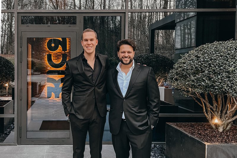
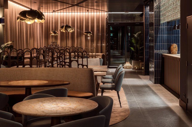
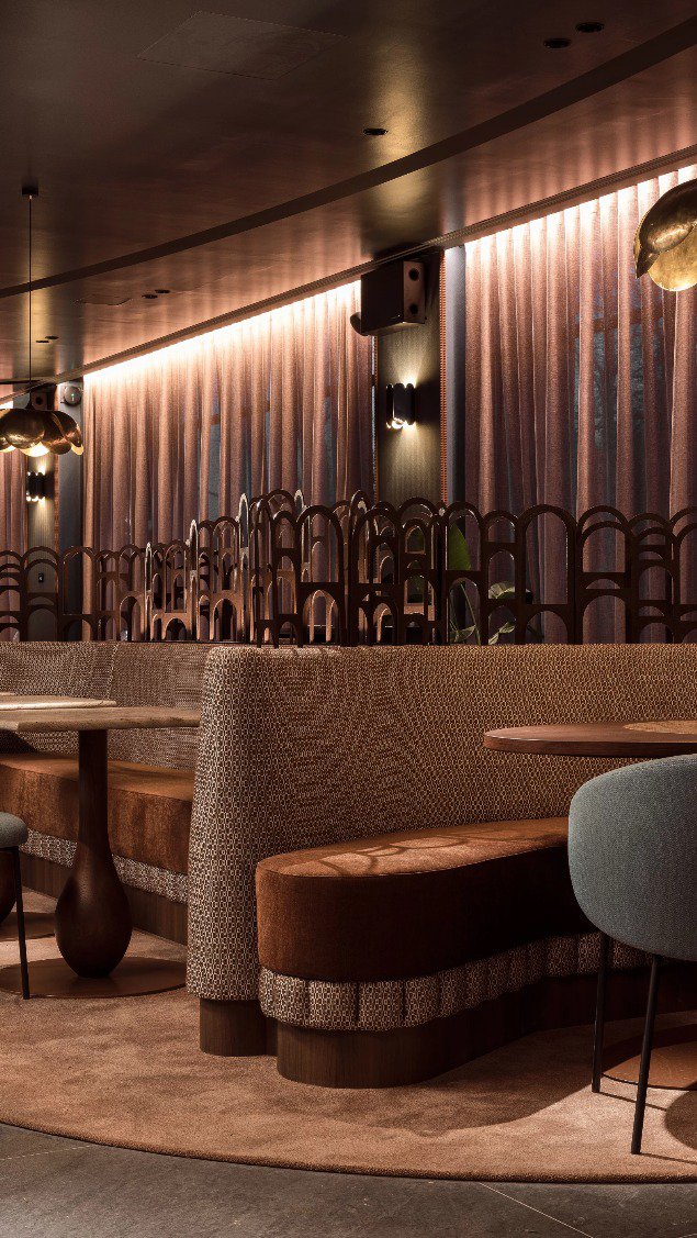
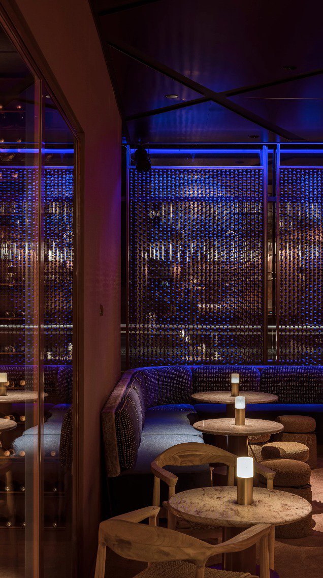
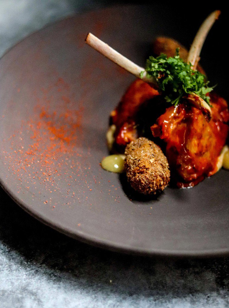
Brussels has recently gained a culinary hotspot: AUM, a vibrant meeting place on the ground floor of the Quatre Bras Tower in Kraainem. Founders are Lucka Wahba, ex-manager at AB InBev and co-founder of UNAH Mind Body Soul and Maxime Gillet, hospitality entrepreneur pur sang and co-founder of the Japanese-Peruvian restaurant SANZARU in Woluwé. The two bosom friends conjured a so-called “High Energy Fine Dining concept” out of the top hat: at AUM, you savour the spicy flavors of Indian cuisine against the backdrop of energetic oriental vibes. The place is a restaurant, bar and lounge in one and transforms into a sultry nightclub from Thursday to Saturday in the late hours where DJs transport insistent Indian beats to the dance floor. We spoke with both founders about the new Brussels crowd-pleaser
as well as about the menu, which seamlessly captures the unique style and atmosphere of the place.

Hey Maxime and Lucka, to cut to the chase: what does “AUM” actually mean?

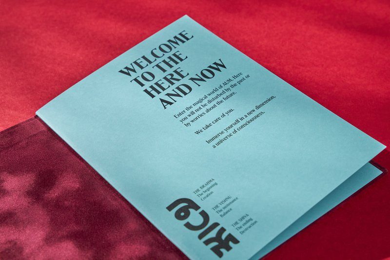
Maxime: ‘AUM is the most important mantra and the holiest symbol in Hinduism. It represents the sound of the universe and the three main gods within the religion: Brahma is the creative force, Vishnu the sustaining and Shiva the destroying. The term so beautifully symbolizes what our restaurant stands for: we want to create a kind of magical world with its own customs, rituals and dress code. That vibrant energy is at least as important to us as the food itself. AUM is a place where you leave all your worries behind and immerse yourself undisturbed in the moment. Music plays an important role in that. Our playlists have even been studied by musicologists to create an authentic AUM vibe.’

Let’s start with the food: in that area, too, AUM cannot be captured by one concept. What can people expect?

Lucka: ‘AUM combines a fine dining restaurant and a food-sharing lounge, separated by a central bar that is indicative of the atmosphere we want to bring. Both zones are in a similar energetic musical ambiance, but offer a completely different experience. In the ifne dining area, you will enjoy innovative Indian-inspired gastronomy a la carte. In the lounge, the atmosphere is more relaxed and laidback. There you share smaller dishes with your company at a low or high table.’

And later in the evening, the restaurant turns into a party venue with DJs?

Maxime: ‘Indeed, on Friday and Saturday you can really fill your whole evening here. The closer we get to the night, the more we turn up the energy level. The absolute highlight here is the AUM Bonfire, inspired by a ritual from Indian culture: we invite DJs for a campfire moment and transform our venue into a sultry dance spot with an emphasis on ethnic, oriental and minimalist sounds.’

At AUM, even the smallest detail contributes to the restaurant experience, not least the interior?

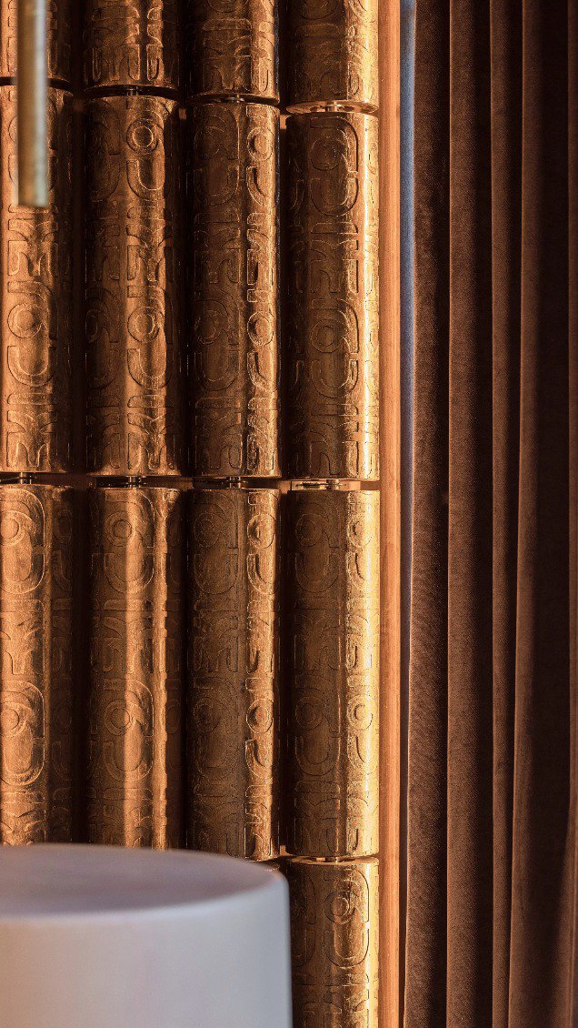
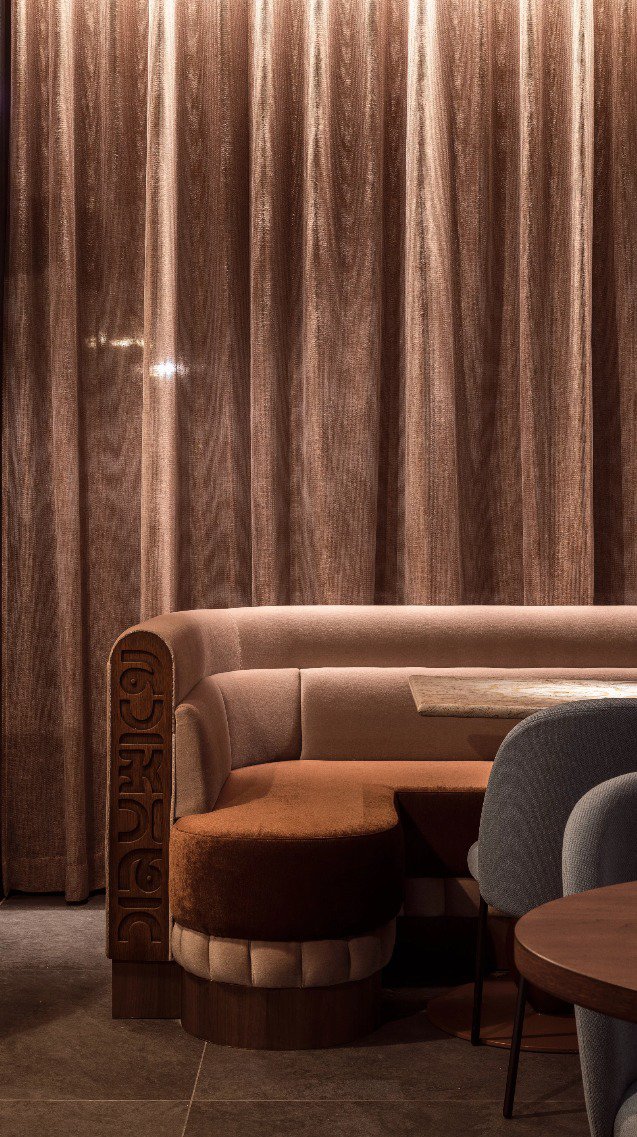
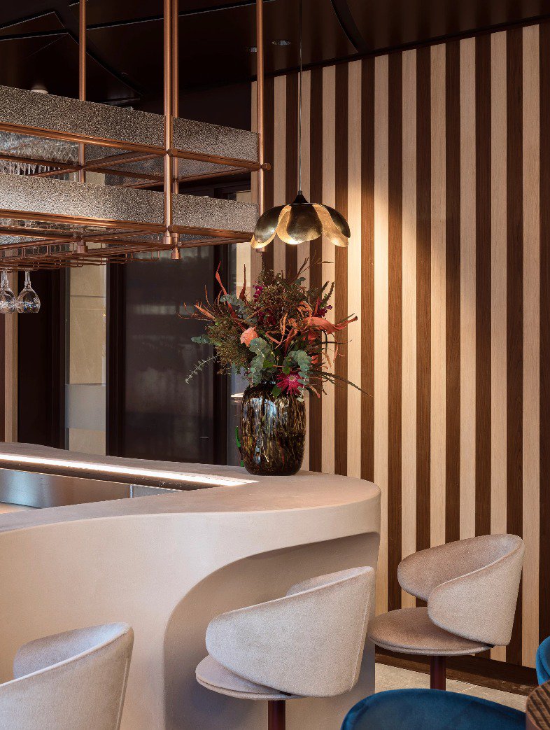
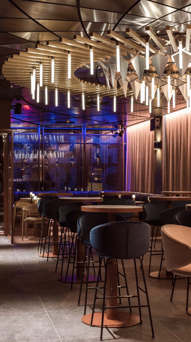
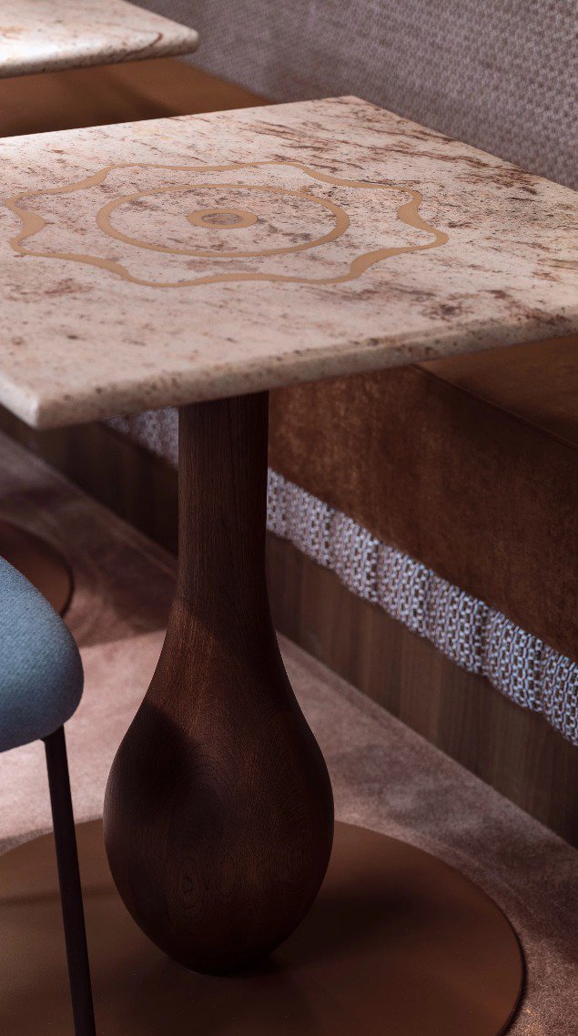
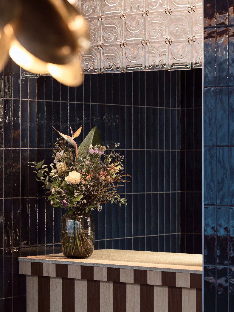
Lucka: “Our interior was designed by WeWantMore. They worked hard for months to really make it something special. From the scenography to the materials, furniture and decorations, everything is custom conceived, designed and created to create a unique atmosphere. The interior has a certain glamorous feel, yet remains close enough to the orientalism typical of the overall concept.’

You are going very far. Even the menus are perfectly matched to the style and atmosphere of the restaurant.

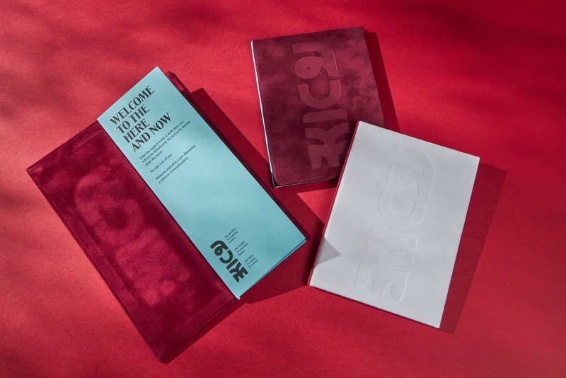
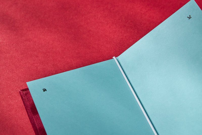
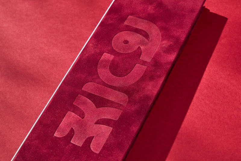
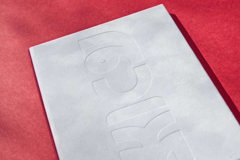
Maxime: “That’s right. The menus are an essential element in our story. Tactility is an important concept for us. The different fabrics, textures and materials in each room stimulate the senses differently. Our menu also falls within that principle. They were printed by you on a chic velvet fabric. It is best to take them with velvet gloves so as not to put fingers on them. Very special. So reading the menu yourself becomes a little experience.

Customer in the spotlight: Bart Kuykens

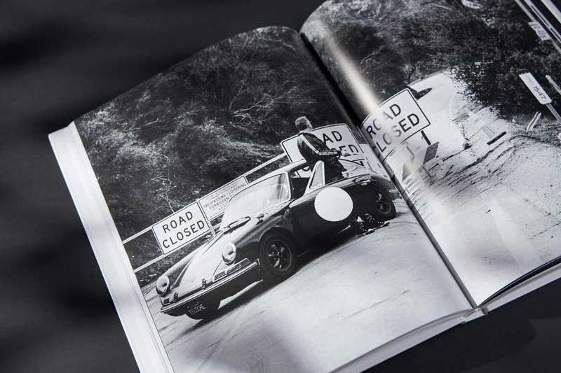
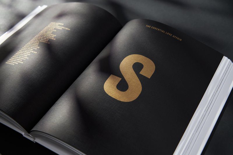
After the success of the seven-volume ‘A Flat 6 Love Affair,’ photographer Bart Kuykens is back with a new art book: ‘The Essential Love Affair’ compiles the best of the previous editions to form the ultimate tribute to his great love, the Porsche. We spoke to the Antwerp native shortly after his return from Das Renn Treffen in Miami, a large-scale Porsche event where he exhibited and was frequently allowed to sign his latest throw.

Man vs machine

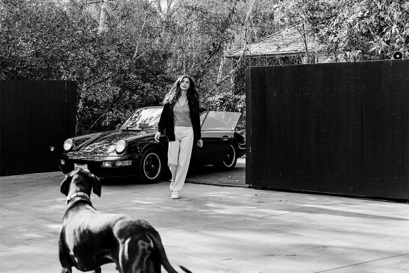
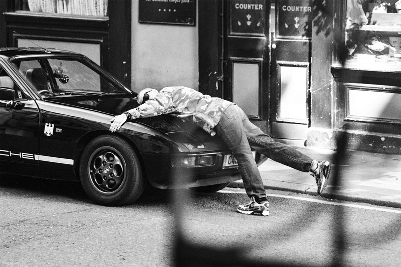
Narrowing Bart Kuykens down to Porsche photographer is actually doing him dishonor. Kuykens is a creative entrepreneur at heart, who once dropped his own clothing line and still runs a casting agency. Before his lens trot not only special cars, but also buzzing names from the film and music industry. Yet he remains best known for his artful black-and-white books dedicated to the Porsche’s timeless form. The Antwerp native himself has several vintage models in his garage, including a 1971 911. “The design and silhouette of that car are iconic,” he says. ‘So simple, so timeless, even a child recognizes it. I find it fascinating that a car from the 1960s or 1970s is still relevant today. But a pure collector I am not. There is much more to life than cars. That is also the point of the books. I am not so much concerned with the vehicles themselves. The images show the intimate relationship between the individual and the car, between the man and the machine. It’s about the interplay of those two characters. About people telling their story through their Porsche.’

“I am not so much concerned with the vehicles themselves. The images show the intimate relationship between the individual and the car, between the man and the machine.”

Kuykens traveled the world for seven years portraying owners and their cars, not infrequently in mysterious and atmospheric locations. From the little guy down the street to celebrated celebrities from home and abroad. From Tom Boonen to Jay Leno, Patrick Dempsey and Paloma Picasso, yes, the daughter of. Throwing those familiar faces in there is of course very nice. Over the years I’ve built up quite a few connections, but a star in front of your camera remains something of an honor. Being allowed to photograph these people gives me a feeling of contentment every time.

Analog black and white photography

Kuykens almost always photographs in black and white. ‘Such images are the most beautiful. They are timeless and always remain relevant,” he says. The results are dark and raw, almost cinematic images. They have a coarse grain, but also exude a certain playfulness and sex appeal. He shoots most images with an analog Leica or medium format Hasselblad. So the traditional way of working, which makes him an outsider in today’s digital world. ‘I also take digital photos, though,’ he clarifies. ‘For commercial assignments, for example. Because sometimes there is less time and then you work faster. But for free work, I always choose analog. That’s the real craft. ‘It slows you down’: it has a certain flow that calms me down. I also come home with far fewer images than with a digital camera. When I shoot analog, I somehow look sharper.’

Printing process as teamwork

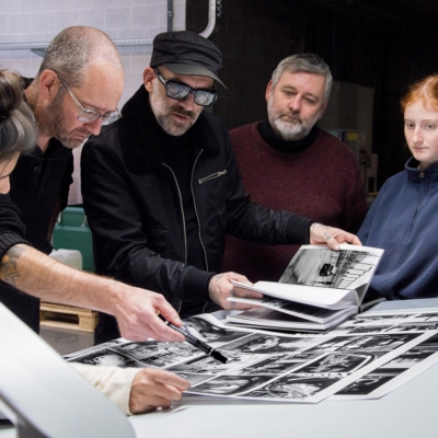
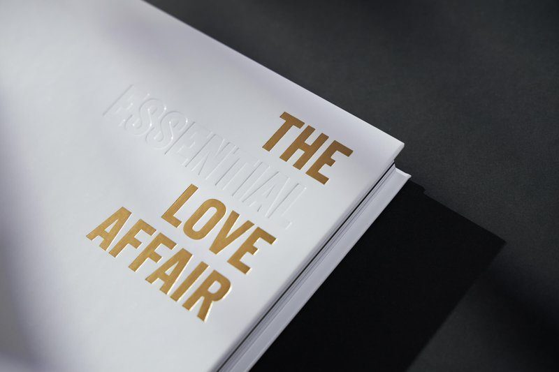
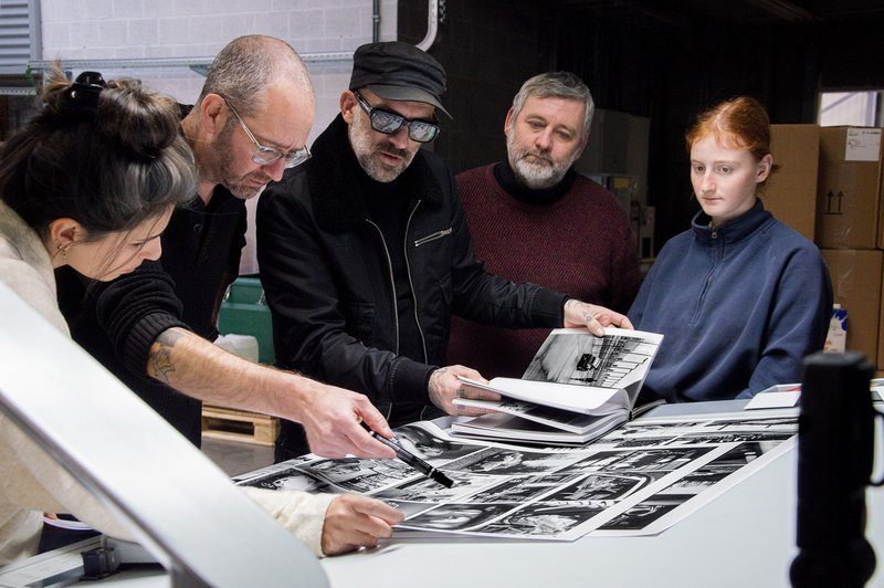
‘The Essential Love Affair’ is a ‘best of’ book. The ultimate paean to a subject that moved the photographer for seven years. For that reason, it was also allowed to be a little different in terms of printing. “I chose Buroform because I wanted something totally different from the previous books, in terms of paper, in terms of feel, you name it,” Bart Kuykens explains. ‘Besides, it’s nice to work with a printing company from the neighborhood. I live in Hemiksem and can pop in whenever I want. Feeling and smelling the paper, testing, testing again, adjusting technical things…. Everything was briefly followed up, together with your team. I must admit that I am certainly not the easiest person during such a process, but this interaction did lead to a result I am proud of. Creating a book with a team is a process of feeling and trusting each other. Of discussing, pushing through, buckling down and coming to a consensus, with the sole goal of delivering a top-notch product. Surely we succeeded in that in my opinion.

The making of: The Essential Love Affair

Kristin en Marie van de Inktvissers op bezoek bij Buroform

Customer in the spotlight: the ‘Inktvissers’

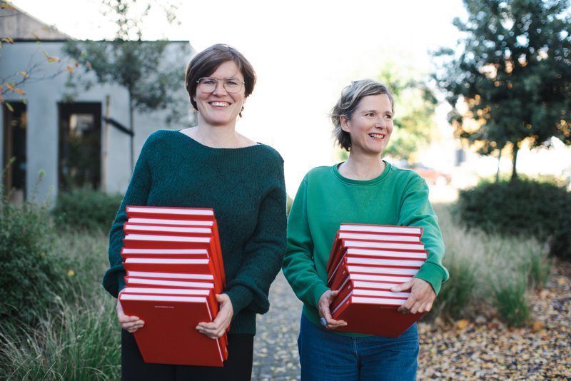
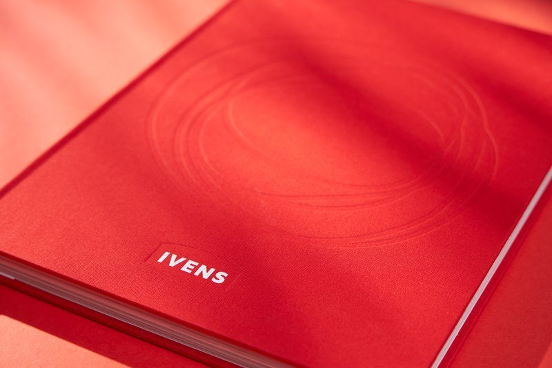
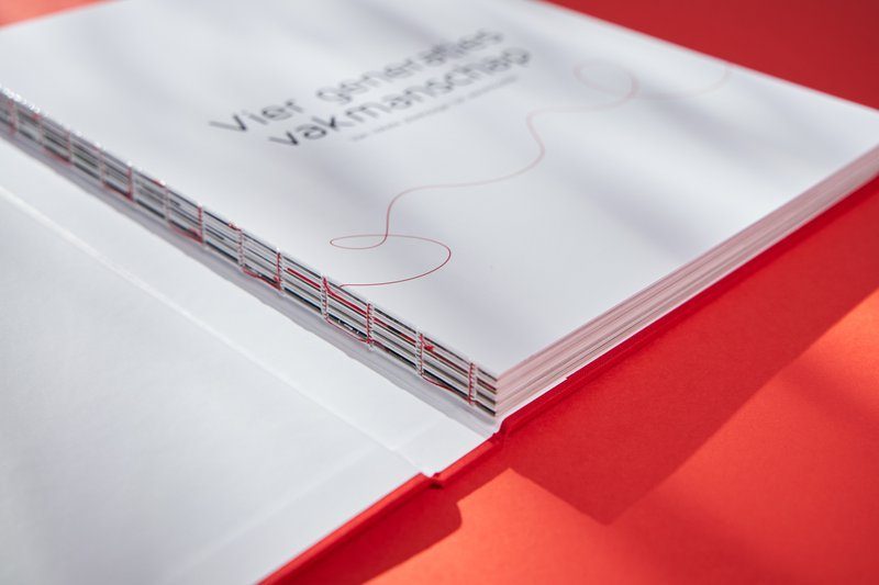
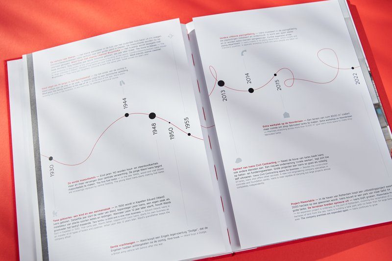
Just before New Year, a fantastic book rolled off our presses: the Ivens jubilee book, on the occasion of the 90th anniversary of the Antwerp manufacturer of storage tanks. In a contemporary and playful way, it tells the history of the family business, interspersed with interviews, anecdotes, quotes, photo reports and illustrations. The result is an anniversary book like you rarely see, lightheartedly told and breathlessly designed, with attention to the past, but also to the company culture, employees, partners and customers.

© Greetje Van Buggenhout – From left to right: Kristin Wuyts, Marie Verdurmen

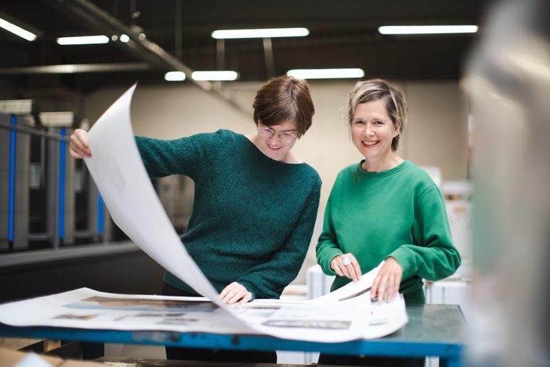
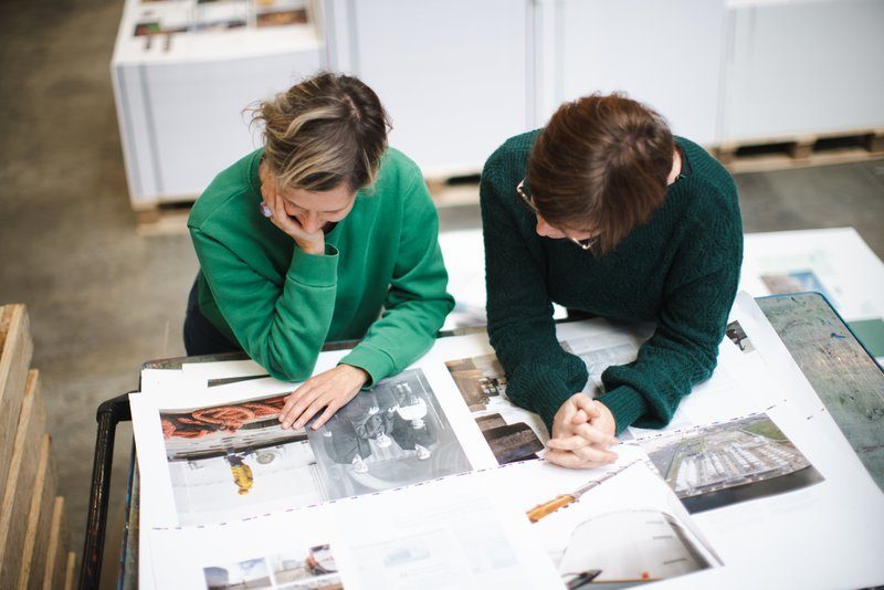
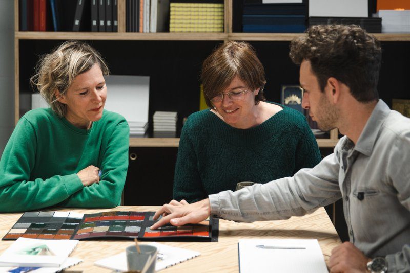
Storytellers on duty are Kristin Wuyts and Marie Verdurmen. The former is an author and communications specialist, the latter an art director and illustrator. Together they form the ‘Inktvissers’, a creative agency dedicated to the development of these types of books. From word to image and everything that comes with it: Kristin and Marie dive into companies’ pasts, angling for the best stories and giving voice and face to the people behind them. Form and content flow together beautifully in the process. We met both ladies for an extended conversation about their love of ink, paper and craft printing techniques.

© Greetje Van Buggenhout

Hey, Kristin and Marie, first things first: “Inktvissers” (the Ink Fishermen), what a great name. How did you guys come up with that?

Marie: “Anniversary books sometimes have a somewhat dull and dusty image. In addition, they are often loose assemblages of texts and photos from the archive. We want to do that differently. Not just with contemporary design and inspiring text, but by really analyzing a company’s story in depth. Our books are honest business portraits that look far beyond the facts and figures. We talk about the people, what drives them, how the world is evolving and a company deals with it. The Ink Fishermen nicely reflects what we stand for: it is a young, fresh, even somewhat playful name. We fish out stories and fully immerse ourselves in a company’s past. All that info then flows together into a coherent and finished whole that stands out both visually and substantively.’

With Ivens, you prove that you can bring a corporate history in a hip and young way. What do you think makes a good anniversary book?

Kristin: “Every book is different, depending on the budget, what the company wants to achieve and the target audience. For us, it is important to deliver a sincere, relevant and refreshing story, in line with the company’s strategic goals. To do this, we work very closely with the client. We talk not only to company executives, but also to current and former employees, customers and suppliers. For the Ivens book, for example, we talked to dozens of people. Then you find out things. Those interviews lead to fun quotes and juicy anecdotes that illuminate the past from a different perspective. With Ivens, they are even the common thread throughout the book. They are micro stories, sometimes funny, sometimes endearing and touching. They give the reader a picture of the past and the culture, without necessarily giving everything away.

“For the Ivens book, for example, we talked to dozens of people. Then you find out things.”

Marie: “You can tell a history in different ways. Sometimes we work chronologically, sometimes we use flashbacks. We integrate milestones, timelines, quotes, archival footage, new photos, you name it. There is no delineated design plan. Variation is the key. With Ivens, for example, we did not opt for a classic division into chapters, but rather a structure around important dates. They are interspersed with photo reports and interviews. I also drew an ink portrait of each of the company managers, giving you an accessible and playful atmosphere.’

© Greetje Van Buggenhout

For what purpose exactly do companies knock on your door? In other words, what makes such an anniversary book so attractive and interesting?

Marie: “There could be numerous reasons for this. First of all, print is very sensory. You can hold it, feel the texture of the paper, smell the pages. Digital is often fleeting; a book is “real. People like having something in their hands. A book you keep and cherish. It is a tangible product that exudes reliability and credibility, and so is especially valuable as branding for your business. An anniversary book allows you to show who you are and what you stand for, as well as where you want to go. You show how you have grown and responded to new challenges now and in the future. It’s a way to increase your brand awareness and highlight your expertise.

Kristin: “Ivens’ book became a very human book. It creates connection. Between management and employees, but also with customers and partners. Everyone who has helped build the company’s history in one way or another is featured. Memories and experiences of countless people are shared. That creates a bond. People feel involved and recognize themselves in the story because they themselves have been given a voice in it.

Ivens’ anniversary book is a very tactile, almost artisanal book. Why that choice?

Marie: “Craft and innovation are crucial to Ivens. The book also exudes that philosophy, on every level. Not only because it departs from the classic structure and narrative structure. The thread on the cover, for example, is a special graphic element that recurs several times throughout the book. In an abstract way, it illustrates the company’s sense of craftsmanship and quality. In addition, the book was given a linen cover, was traditionally bound with red thread and we chose an FSC-certified paper. All these elements together give the final product an artisanal look and feel, indicative of what Ivens wants to tell.’

© Greetje Van Buggenhout

You chose Buroform as your printing partner. How does our printing company fit into your story?

Kristin: “We got to know Buroform through Café Cliché. A very interesting initiative that creates engagement. You feel the drive. The desire to inspire creative people to give them more options. Buroform shows that it is with the times and can take your work to the next level. That won us over.

Marie: “A good printer translates your creativity into reality, in a feasible and affordable way. As a graphic designer you have many ideas, but not everything is always possible. By thinking with us and offering different solutions, Buroform guided us perfectly. For the cover of Ivens, for example, we chose intaglio printing instead of blind embossing: less expensive, but no less beautiful. We received explanations and saw a lot of examples. That helps to make choices, even if they involve minuscule details. But it is just those little things that give your product the right look.’

Website: www.inktvissers.be/
LinkedIn: www.linkedin.com/company/inktvissers/
Instagram: www.instagram.com/inktvissers/
Facebook: www.facebook.com/inktvissers

Customer in the spotlight: Martine Hul of jewelry brand Hulchi Belluni

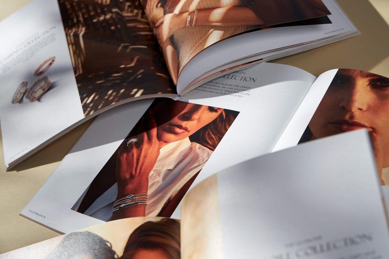
Our eyes twinkle because Hulchi Belluni ‘s new catalog is out. The jewelry brand is undoubtedly one of the most extraordinary in our country. Not only is it distinguished by a very sophisticated design aesthetic, the label is also based on a unique vision: its collections are based on “Chi,” the positive life energy according to Eastern Feng Shui philosophy, which brings harmony to body and mind. We spoke with founder and inspirer Martine Hul. She first unleashed her vibrant creativity on the world more than 20 years ago. She has since conquered most of that world single-handedly with her sublime collections.

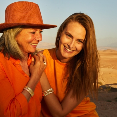
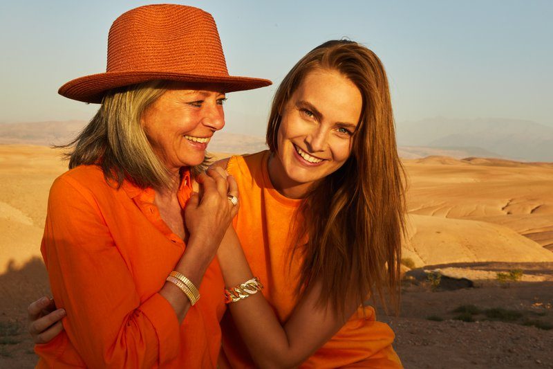
Martine with model Jenna on the shoot in Morocco.

Hello Martine, behind Hulchi Belluni’s designs is a special symbolism, largely based on Feng Shui. Please explain?

“Feng Shui is an ancient Chinese art of living that revolves around the five basic natural elements. Central to this is ‘Chi,’ a positive energy that brings peace and balance to your life. Some thirty-five years ago, I came in contact with the philosophy through a friend. Since then I have continued to study it. The idea is that when all the elements of your life are in balance, you are in harmony with yourself and your environment. In other words, when your “Chi” is right, you feel better, healthier and happier. Our jewelry radiates that positive life force. They are happiness symbols that translate personal emotions. In fact, ‘Chi’ gives direction to everything we do at Hulchi Belluni. The interior of our offices, trade show booths, the family functioning within our team, the enthusiastic collaboration with clients and partners: you can find that positive vibe in everything.”

The term “Chi” is contained in your name. Hul in turn refers to your own family name. But Belluni also refers to “Bella Luna,” the moon. How important is it?

“The light of the moon is something very special. There is a kind of mysterious romance emanating from it that can touch me very much emotionally. In am an avid Africa traveler. On my first trip to the continent, I stayed in a lodge during a safari. In the evening after one of our trips, I wanted to take a shower. As I stepped outside, I was caught by that twinkling object in the sky. That frenzied light source right above my head, in the blackness of the night with only the silence of nature around me: there was something magical about it. That moment has always stayed with me.”

Today, Hulchi Belluni’s offerings are vastly varied. How would you describe the collections themselves?

“Hulchi Belluni once started as a classic line. Today the collections consist of different styles, largely focused on the sport habillé. We have a jewel for every type of woman. Small, large, soft, wild, fine, set, you name it. Comfort is key here. The majority of our jewelry is meant to be worn every day. They are very feminine, but not flashy. A piece of jewelry should subtly contribute to your personality. It should be part of your identity and accentuate your character, without being overpowering.”

Where do you get inspiration for your designs?

“My inspiration comes from the moment. For example, the shape of a building or object can touch me. Or something I see at a restaurant, on a museum visit or while walking. A special shoe, a key on a door in an Italian alley…. Everything around me can be a trigger.”

A new catalog is coming out. The footage was shot in the desert of Morocco. Why that choice?

“As I mentioned, I am a big Africa lover. No matter which country you visit, each time you are introduced to a totally different world so far away from what you are used to at home. The animals, the nature, the smells, the silence: the purity of Africa attracts me and I also find it in the desert. That’s where I feel happy. A jewel also comes out much better in the midst of such a setting. The light there is very special. In a forest, for example, there are too many impressions. I want as pure a landscape as possible, in which the power of the jewel can be fully expressed.”

Buroform printed the catalog. How did you get in touch with our printing company?

“For the new catalog, we wanted to break new ground. It all needed to be a little more daring and different, and Buroform is the place to be. Until before this, we always had our lookbooks printed digitally. This time we chose offset, a special paper and some wonderful techniques that enhance the experience of the lookbook. For example, because we work with many spread photos, we chose OTAbind as our binding method. Thus, the book always falls open nicely. The cover incorporates the logo with blind embossing, which gives a very nice tactility. In addition, we opted for a special paper that brings out the jewelry in the best possible way. These days, matte papers with a grain are very in, but that doesn’t work if you want to highlight jewelry. It has been a quest to find the right type of paper, but you assisted us very well with that. The end result is exactly what we envisioned. The catalog perfectly conveys what we do at Hulchi Belluni and who we are. It is the work of an entire team, both people within our own company and outside talent. That’s the beauty of this story.

Meet the Buroform crew: Sarah De Laet cover

Meet the Buroform crew: Sarah De Laet

Buroform is brimming with talent. Wondering what it’s like to work with us? Take a look behind the scenes and meet our team. Today in the picture: account manager Sarah!

Hey hey, I’m Sarah! If we’ve met before, you’ll no doubt remember me because of my height: at 1.8m, I literally stick out above.😊 Since October 2022, I’ve been working at Buroform as an account manager, my first real work experience after I also previously interned here in the graphics and marketing team.

At Buroform, I am responsible for…

‘As an account manager, I assist customers with their printing needs and help find the best solution for their ideas. A job I love immensely. Not only because of the human factor, but also because I can fully express my love for graphics. As a designer, I have extensive knowledge of paper types, printing techniques and finishes. This allows me to give people targeted advice, which I personally enjoy immensely. There is nothing like customers who become genuinely happy when they see their finished product.’

I got my job at Buroform through…

‘I am convinced that everything happens for a reason. What comes your way is meant to be. Three years ago, I earned a degree in Communication Management and PR in Mechelen. In June 2022, I will graduate as a graphic designer. After coming in contact with Buroform, I spontaneously applied there. I was able to start immediately in the graphics and marketing team. That spontaneous application has taken me far in 1 year. When after a few months I also expressed interest in a sales position, I was immediately offered this opportunity. The great thing about Buroform is that you get all the room you need to grow and learn, and I really enjoy that.

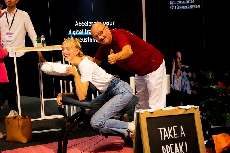
Just relax at the fair – Bloovi Entrepreneurs Summit

My morning ritual is…

‘Shah, my morning ritual… That’s another matter, haha. These days I try to go to sleep early as a function of a slow morning: waking up quietly with yoga, breakfast and music in the background. At least that is the goal, because in reality, it is not really succeeding yet. Still, quiet awakening is important to me. It helps me start the day with a positive mindset. When I arrive at the office afterwards, I check my emails first. Afterwards, and especially in winter, I warm up a cherry pit pillow. A habit that dates back to during my studies. The heat helps me get to work faster. Plus, it’s nice and warm on the legs.’

What people don’t know about my position is….

‘For many people, an account manager is someone who sells and maintains relationships: you help increase sales, advise existing customers and acquire new ones. At Buroform, this involves much more. Every Thursday we have sales meeting. We go over the week, listen to each other and discuss everything that concerns us professionally, both the positive and negative things. That way you not only get to know each other better, you also learn from each other’s experiences. Communication is key! That is so in all situations of life by the way.’

My proudest moment at Buroform is….

‘That’s a tough one. As a starter, I am already proud of the smallest achievement. Recently, a client told me that she liked that I had helped her so quickly and accurately, especially since I had to deal with a relatively tight budget. That was gratifying. In addition, a while back I attended the BNI where my colleague Kelly goes every Friday. At 60 seconds you have to pitch your business. Stressful, but I managed.

What I like most about working at Buroform is….

‘I don’t want to be cheesy, but: everything! It’s great to be creative with my passion for graphics. Besides, every day is just different. Each time I am curious to see what comes my way. And then, of course, you have the colleagues. From the beginning, they took care of me. The work atmosphere is fantastic!

If I had not become an account manager, I would have…

‘My first thought was graphic designer. Not too long ago, I actually wanted to start self-employment. Thanks to Buroform, I have gained a broader perspective. I have realized that I can use my graphic knowledge in other ways. In addition, the social aspect within a company offers great value. The contact with colleagues and customers helps you grow and learn. Being self-employed, you don’t have many people around you, at least in the beginning. My experience at Buroform has pulled me away from the idea of sitting alone at a desk with fine music playing in the background.’

On weekends you’ll find me…

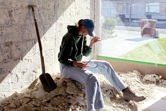
‘Currently mostly in the yard. My boyfriend and I bought a house this summer that still needs a lot of work. Everything must be demolished and rebuilt. The ultimate relationship test, then. For now, everything is going smoothly and we can’t wait to move into our own little house. In addition, I try to find rest on the weekends mainly by being able to be by myself for a while, meet up with friends or just do something with my boyfriend for a change.

The best career advice I have ever received….

‘Growth is done outside your comfort zone. You only learn by doing things you wouldn’t normally do or for which you feel a certain resistance. Jesse had forwarded a video the other day from Rabbi Dr. Abraham Twerski, explaining how we can learn from what a lobster does. Feel free to look it up, incredibly inspiring!

Stay tuned. We continue to share stories about each member of our team. That’s how you get to know what it’s really like to work at Buroform.

Would you like to be part of the #buroformcrew? Then take a quick look at our vacancies. We are looking for a bookkeeper and an office manager.

The key to success in 2023: this is how to devise a rock-solid print campaign

The start of a new year also means interpreting numbers about the past year, setting new opportunities and goals, and making good resolutions. If you just recognized yourself in this, don’t leave. Below we list all our tips for setting up a rock-solid print campaign and back them up with examples from our own portfolio. Let’s go!

Imagine going out to a restaurant and having to scan the menu with a cell phone that is slow and worn out? Or that you go to a trade show with digital business cards but the person you want to network with hands you a physical business card.… 1-0 to your opponent! This is living proof that a print campaign can help you get a better “grip” on your target audience.

What is the goal of your campaign?

Before you begin setting up a campaign, it is important to have a clear goal. What do you want to achieve with your campaign? More leads to your website? More visits to your store? More awareness or more sales of a particular product? By clearly articulating your goals, you (and your team) can come up with the appropriate solution in a more focused way.

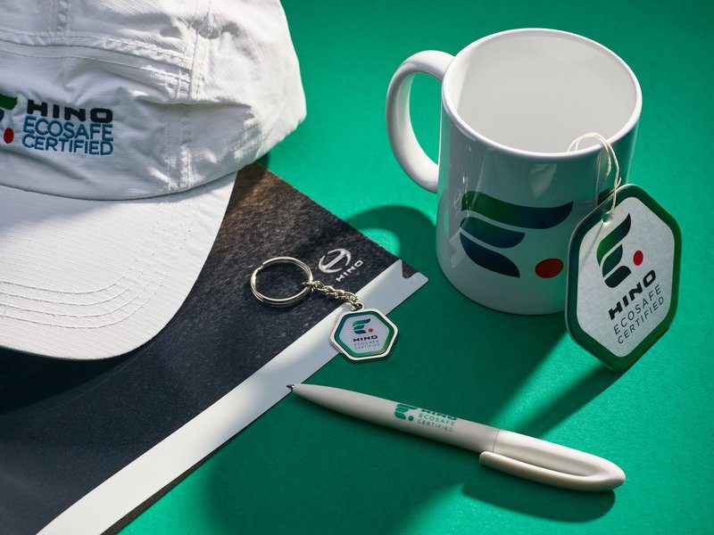
Inspiration: Hino Motors
The goal of Hino motors is to generate more awareness for their newest Ecosafe Certified label. To do so, they shower their target audience with various useful print gadgets in their corporate style, including: mugs, key chains, a water bottle, ballpoint pens, folders, caps, backpacks, t-shirts and jackets.

Who is your target audience?

It’s important to know who your target audience is so you can communicate the right message and use the right medium to convey that message. Use market research to understand the needs and interests of your target audience.

Choose the right medium

Various print media are available, such as brochures, leaflets, posters, and so on. It is important to choose the right medium that suits your goals and target audience.

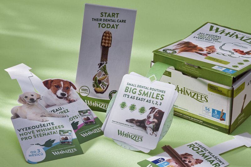
Inspiration: Whimzees (Wellpet)
Whimzees targets dog owners. Images of dogs naturally create recognition among their target audience. To literally stand out among the other products on store shelves, wobblers are a great medium. Check out the full case of Whimzees here.

Define the value proposition

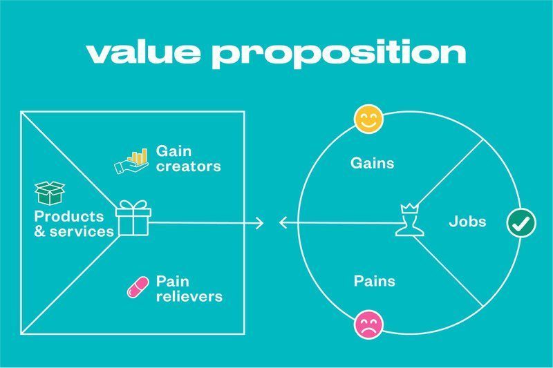
Modern marketing is all about valuable and relevant content. For that, you need an understanding of your target audience’s lifestyles and challenges. With rock-solid content, you offer your customer a solution to their problem or contribute new ideas they can benefit from. The value proposition canvas can be a useful tool for determining what pain points you want to address in your campaign and how you can surprise your ideal client with new solutions and ideas. This is how you turn your print campaign into something valuable and relevant to your target audience. The value proposition canvas consists of two parts: the customer and the offer. It comes down to asking the right questions from the customer’s point of view as well as your offer.

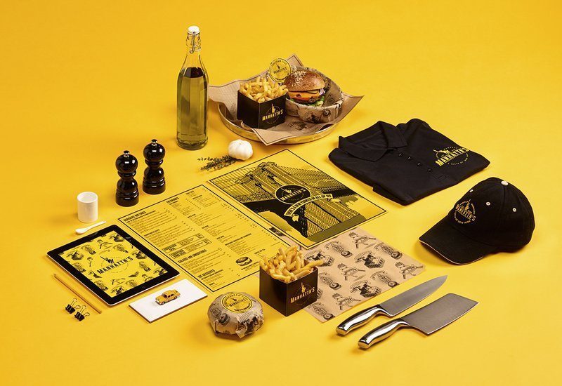
WeWantMore – Manhattn’s burgers

Make the design stand out

Create an attractive and professional design: The design of your print materials is important because it grabs the reader’s attention and conveys the message. Make sure your design is attractive and professional looking, and that it is clear and easy to read. Use consistent colors and styles to maintain a professional and recognizable look.

Make sure your message is clear and easy for your target audience to understand. Also try to match the message to the needs and interests of your target audience.

Inspiration: Manhattn’s burgers
In addition to a banging design, the medium is also sharply tailored to Manhattn’s target audience: sulfate paperboard is a tough and tear-resistant paperboard with the highest whiteness among paperboards. An ideal paper for a finished product (menu card) that can be used frequently without wear and tear. View Manhattn’s full case study here.

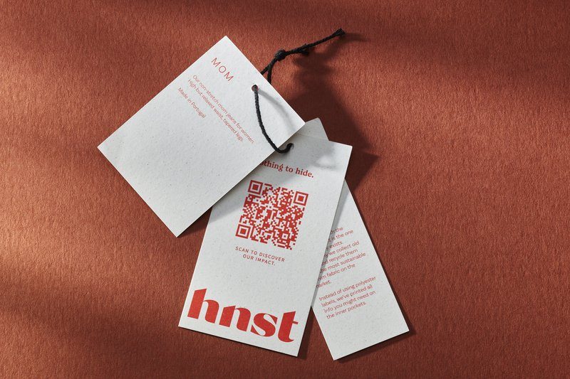
Inspiration: HNST

Create interaction

The best-known and easiest way to create interaction with your target audience is a QR code. And the great thing about this is that the statistics of your print campaign become measurable. You immediately know how many times a QR code was scanned and from what location.

By asking questions in your print campaign or inviting people to comment, you can create interaction and encourage readers to engage with you.

With these tips in your pocket, you’ll provide an ironclad weapon to achieve your goals in 2023. Also, remember to keep trying and adapting so you can keep innovating and make sure your print campaign continues to appeal. Do you have a great idea? Then Kelly and Sarah go to work for you to get your campaign down to the last detail.

These books were launched during Café Cliché

Café Cliché is our way of giving you more insight into the endless possibilities of print. Each edition covers a different theme and is flavored by numerous experts over delicious finger foods and drinks. We’ll shower you with ideas and examples so you can discover what print can really do for you. In honor of Café Cliché, we created and launched 4 art books. Each book in itself is very different and in its way always links to a current topic. What makes the books so special? You’ll discover that here.

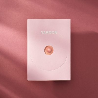
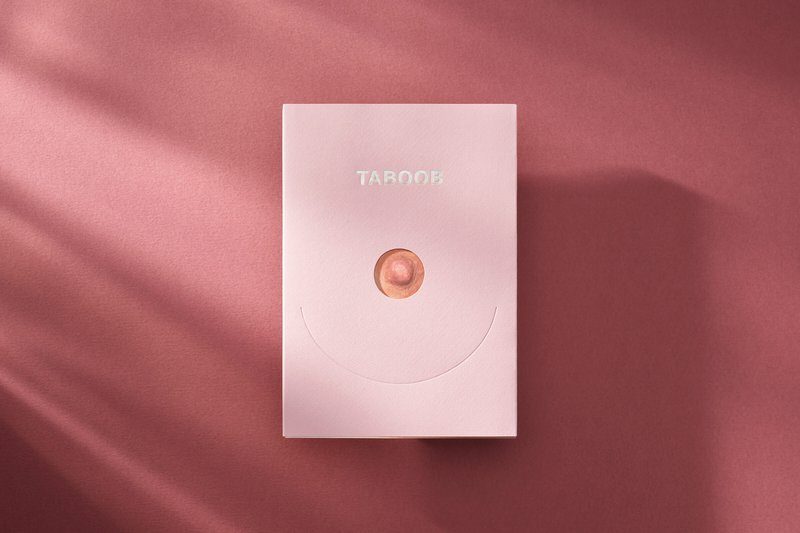
TABOOB by Noortje Palmers & Jasper Declercq

TABOOB is an idea of Noortje Palmers and Jasper Declercq. With the project, they wanted to test how far censorship of women’s breasts extends on Instagram. The project went viral on Instagram but was removed from the Internet in no time. Now the project was immortalized with a book.

→ more about TABOOB

OUTSIDE by Carolle Servayge

Extraordinary is Carolle Servayge’s debut novel and a plea for self-acceptance and positivism. The book brings together photographs and personal stories of people with special external features, challenging today’s stereotypical ideals of beauty.

→ more about Extraordinary

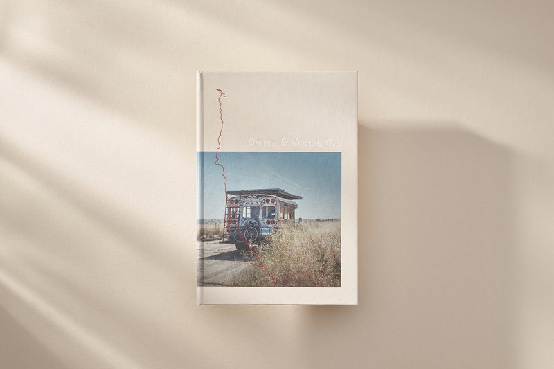
DIESEL & VEGGIE OIL by Timo Vergauwen

While touring America, videographer Timo Vergauwen met the American folk band Handmade moments. He decided to follow them. Without realizing it, a breathtaking story was waiting for him. The group ended up in a head-on car crash – and as if that wasn’t bad enough….

→ more about Diesel & Veggie Oil

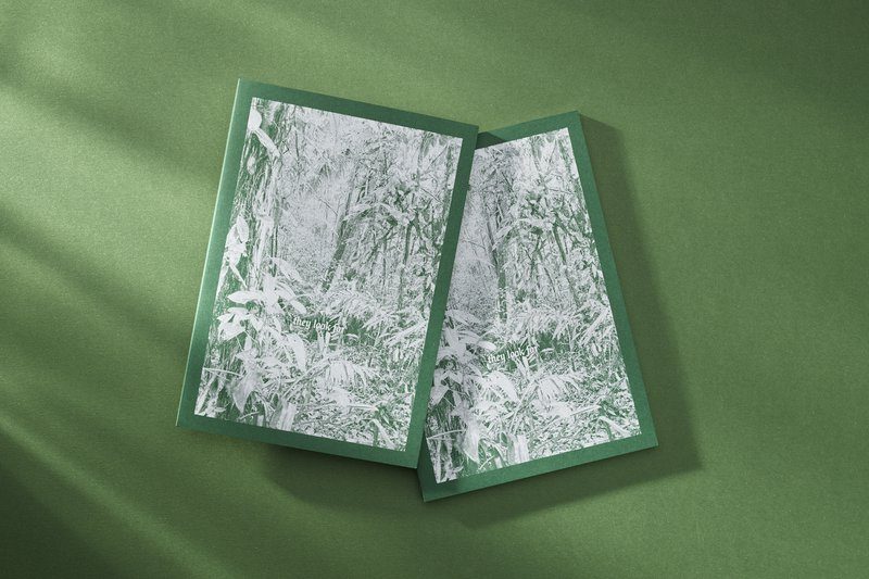
THEY LOOK FOR by Stijn Van der Linden

When he visited Corcovado and other national parks in Costa Rica years ago, he noticed how other visitors were mainly interested in spotting animals. They let the immense diversity of the plant kingdom pass them by, while just that blew Van der Linden away.

→ more about They look for

These books are packed with print “candy. It’s up to you to discover them! Do you want them on your book shelf? Each book is available separately, or you can choose to order the full package.