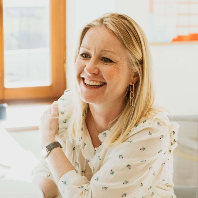
Buroform across borders: A conversation with Claire Evrard of Switzerland’s Common Modern

International recognition for Buroform is on the rise, as our printing company increasingly catches the attention of designers and businesses from abroad. One such enterprise is Switzerland’s Common Modern, with whom we’ve had a close collaboration since last year. The production agency specializes in luxurious office items, from planners to notepads and notebooks, distinguished by their natural prints in challenging color combinations. We spoke with founder Claire Evrard about her unique sense for quality printing and how she extends it into her so-called ‘Nature Pop-style’.

Hi Claire, starting at the beginning: why did you start Common Modern?

“I worked as a graphic designer for over 20 years for a variety of clients, from small boutiques to large international corporations. My career took me around the world, to places like Melbourne, London, New York, and Singapore. Having contributed to so many brands and seen them flourish, there came a point where I wanted to start my own brand. In Switzerland, it’s hard to find office supplies with a distinctive graphic style, so my decision was quickly made. Moreover, I’ve always loved printing. Throughout my career, I’ve worked with many printers and was fascinated to see how the printing process unfolds. Four years ago, I officially launched Common Modern, which focuses on everyday office products with a playful yet sophisticated design.”

How would you describe the collections of Common Modern?

“Nature is my major source of inspiration. Graphic patterns and motifs always start from natural forms and silhouettes. Moreover, color is key: I love bold and unexpected color combinations. This way, I’ve developed my own style, which I call ‘Nature Pop’: nature-inspired designs that simply pop. For instance, the first collection is named ‘Ginkgo Pop’. This line was created based on the leaves of a young Ginkgo Biloba tree at my home. Other collections are inspired by, for example local Swiss fruits, shells from Australia, or the forests around the region where I live.”

Besides the ‘standard’ office supplies, you also develop custom products. What can clients expect?

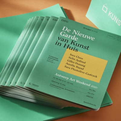
“The premise of Common Modern is to design everyday office items with that little bit of extra finesse. Notebooks, calendars, cards, planners – we always try to add something special. This way, we create something that inspires people and isn’t just thrown away after use. Our products are fun to give, enjoy, and keep. Increasingly, we also design custom stationery collections for museums that connect with our Nature Pop style.”

Nature is more than just an inspiration for you. You consciously choose eco-friendly materials and production processes. How important is sustainability to common Modern?

“I’m concerned about our planet. About the future of our children. With Common Modern, the goal isn’t just to put more stuff into the world. The products need to be useful and recyclable. Materials, production processes, and partners – everything and everyone we work with most support this vision. Sustainability is thus embedded in our entire business philosophy.”

How did you come into contact with Buroform?

“A while ago, I was looking for a new technique for a special planner I had designed. At some point, I got in touch with a Belgian bookbinder, also a partner of Buroform. They recommended I visite you and introduced me to Jesse. After a fruitful discussion and a tour of the printing company, things started rolling.”

Why choose a Belgian company?

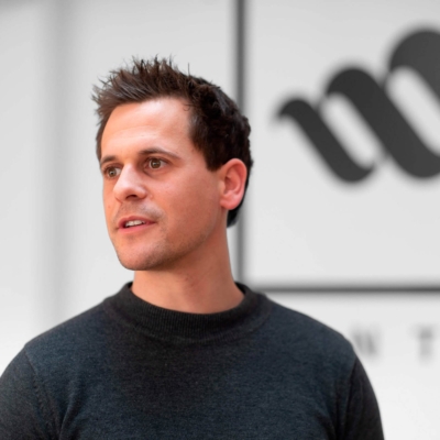
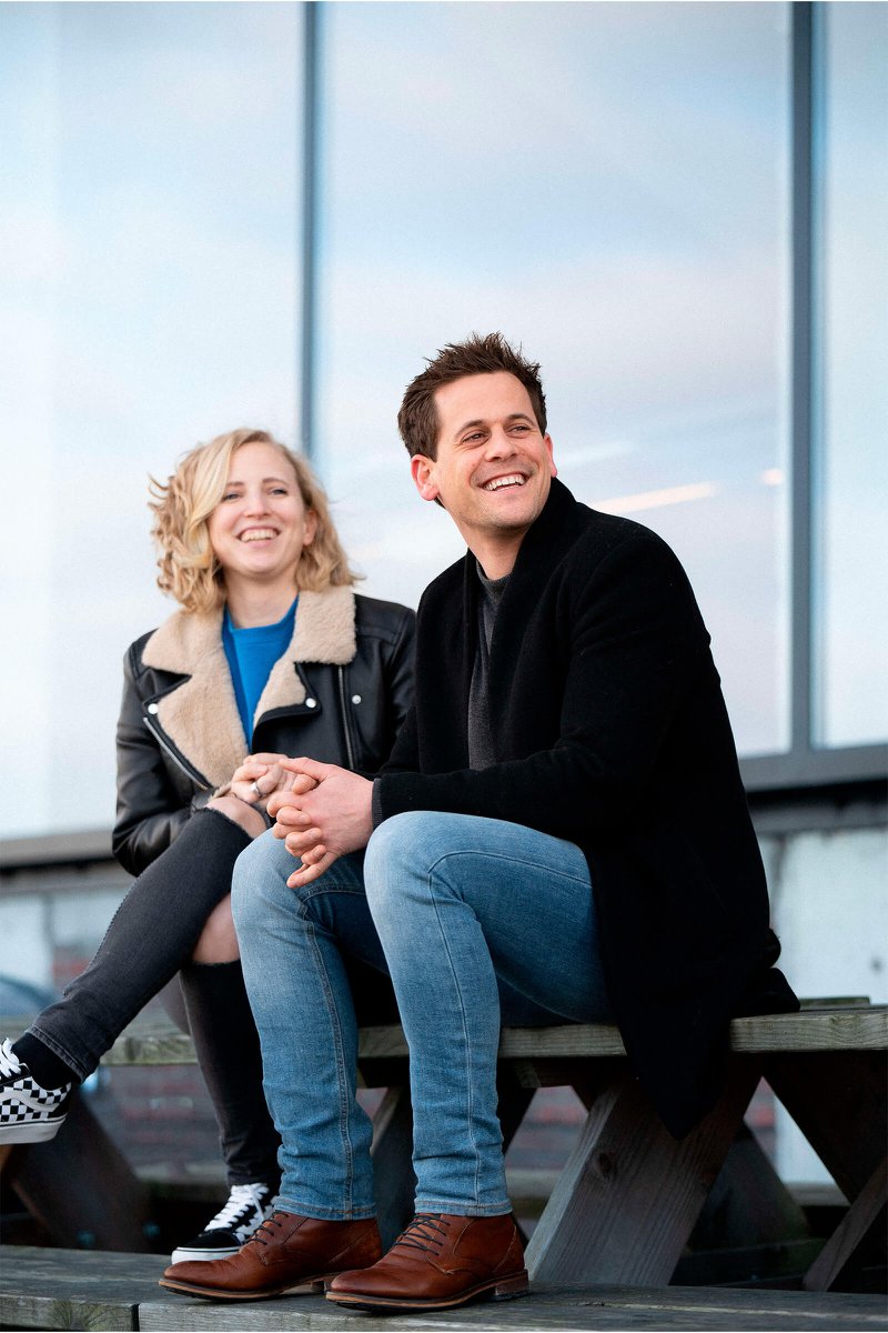
“For me, it’s important to create products that are truly high quality. At the same time, I want to keep the production process as close to home as possible. I was looking for a partner within the EU. Since my husband is Belgian, I quickly ended up in your country. I have a lot of family here and visit regularly, also for my work. Additionally, from the first contact, I had a very good feeling. Jesse showed me around the printing company and a range of completed projects. I was thoroughly impressed. Detailing is incredibly important to me, and you can tell that Buroform is just as committed. I love the feel of paper, the sensation of writing on it, the richness and depth of colors, the perfection of binding, special printing techniques, and so on… That Jesse and his team immediately understood where I wanted to go with my story completely won me over.”

Common Modern is booming. What plans do you have for the future?

“Soon, we’ll be launching a new design service for museums, botanical gardens, and cultural centers. The idea is to release collections that tap into the story and unique location of those organizations. If this becomes successful, I’d like to extend the service to other companies and sectors. Translating strong brand stories into Nature Pop is the big goal for the future.”

Thank you for your time and enthusiasm, Claire. And wishing you lots of success!

Customer in the spotlight: success entrepreneur John Jansen

Dutchman John Jansen must be one of the most successful entrepreneurs in the low countries over the past two decades. A good twenty-seven years ago he founded DynaFix, a repair company with an innovative vision of screening, repairing and overhauling phones. It would set the tone for dozens of similar projects that the South Limburg native then subsumed under the name “DynaGroup. In no time, the organization grew to become the Benelux market leader in smart integrated services and solutions for the total supply chain. In 2019, Jansen sold his last company: it was time for a well-deserved sabbatical. And for a book. That we were allowed to print. In tête-bêche still.

“Feel free to interrupt me if I digress too much. My brain sometimes works faster than I want it to, and then my words also dare to shoot in all directions.” John Jansen has to laugh about it himself. As driven as he is as an entrepreneur, he is so enthusiastic and open in life. “Anyway, that chaotic thing is actually also my great gift,” he continues. “My head manages to make connections that others don’t see. As a result, I come up with unexpected ideas and solutions. You know, my childhood was pretty tough. As a child I learned to shut myself off from that difficult environment and create my own world. From a young age, I had to find my own way. To cope with my problems, I came up with all kinds of crazy solutions. I later applied that approach and way of thinking to different industries.”

“My brain is a turbulent thing, but it helps me see solutions that others are often blind to”

Smart process improver

As “crazy” as his ideas may be, as an entrepreneur John Jansen is extremely thoughtful. Feel free to call the Dutchman a serial entrepreneur: over the past twenty-seven years, he successfully stomped more than twenty companies out of the ground in a variety of sectors. In all, he employed a good 10,000 people during that time and raked in numerous awards. In addition to repairs of smartphones, laptops and coffee machines, among others, DynaGroup also provides logistics services, offers IT, insurance and healthcare solutions and installs products such as televisions, washing machines and printers in people’s homes and offices.

“And say it all started with a heady idea in my garage sometime in the early 1990s,” Jansen looks back. “I was repairing medical equipment at the time. At a certain point I thought: if I can do this, I can also repair phones. About forty percent of the products sold broke down during that period. Moreover, the repairs took an incredibly long time. So I came up with a solution to repair phones faster – within 48 hours – and to optimize the entire logistics involved. Later I did the same with coffee makers. Then with laptops, drones, and so on. Each time, the approach was the same: I saw a problem in the market and looked for a solution. Then I brought together the right people to realize that idea, which translated into the improvement of numerous processes and the development of new supply chain concepts.”

Tête-bêche book

Just before corona, John Jansen sold his last company. After decades of grueling work, sometimes up to 80 hours a week, he needed a rest. “My work had become a kind of drug to deal with the difficulties of the past,” he confesses. “By working unrestrained a lot, I suppressed that pain. I always felt that way anyway. After selling my businesses, I needed a period of reflection. I wanted to re-energize. Over time, I started writing things down. What had happened to me over the years. What was good and what wasn’t. During covid, that gained momentum. I talked to a lot of young people who were struggling with themselves, their jobs, their businesses. It gave me the idea to compile my experiences in a book. Because by bringing all those separate stories together, maybe I could help others?”

Jansen hired a ghostwriter and compiled his life story with some 30 practical examples for entrepreneurs. We then translated that duality as a printer into a book in tête-bêche or reverse printing: the bio-text starts at the “front”, the tips and tricks start at the “back,” so that the final pages of both pieces face each other in the middle of the book.

“On the one hand, I tell my story, with my own anecdotes, but also with input from partners, employees and clients. If you then turn the book over, you discover thirty life lessons. The biggest message here is that business doesn’t actually have to be difficult. You have to believe in what you are doing and then give space and shape to your imagination. This is not always obvious, but at some point you will get there. Don’t get stuck on things that don’t work out. Try again and again if necessary.”

“Don’t get stuck on things that don’t work out. Try again and again if necessary.”

Strong corporate culture

1,000 copies of the book have been printed, but Jansen is already thinking of multiplying that print run. “I’m really impressed with the work done,” he says. “Not only from the quality of the printing, but also from everything around it. I visited a number of printing companies. At Buroform I had the best feeling: I saw people who are eager to deliver a top product. It is a young and fun team that works proactively and fulfills all agreements. I find a lot of myself in that way of working. The culture in my companies has always been an anchor. Your employees have to carry the values of your company, but you also have to create a framework that makes such a thing possible. People need to feel good in an organization. At Buroform, I feel that positivity and drive. There is something there, a story that every employee believes in and wants to rally behind.”

Gault&Millau x Buroform

When you have a passion for what you do, any success of your partners is also your success. We were completely speechless and at the same time overwhelmed with pride when we learned that 18 of our clients are listed in the Gault&Millau Guide 2024. Incredible recognition for the hard-working teams behind these top businesses.

Thyme 12/20

Nestled in a beautifully renovated old farmhouse, Brasserie Thijm is the beating heart of Schilde. The moody terrace provides the perfect backdrop for any dinner party. Our extensive menu is a melting pot of worldly flavors, including delicious vegetarian options.

Design: UNIKAVI – Brand builders

Living Room Restaurant Dante 13/20

Warm hospitality and refined flavors with chef Sven Fonteyn and hostess Otis Claes. In this intimate establishment, they unveil a multi-course menu full of culinary surprises. A visit to Dante is a symphony of flavors, served in a warm, homey atmosphere.

Copyright: wim knapen

Pont Neuf 13.5/20

Pont Neuf, charmingly nestled near London Bridge, welcomes guests with open arms and an open kitchen. Led by hostess Dominique Leroy and chef Tommy Bocklandt, this stylish restaurant attracts a loyal clientele attracted by its pure, classically inspired cuisine, free of unnecessary frills.

Essenz 13.5/20

Having proven his ability at Faim and Verso Café, chef Joris Hoefkens has now teamed up with Benthe Vande Woestijne to create an intimate eatery in Antwerp’s Kronenburgstraat. Here he indulges his guests with a menu full of sophisticated flavors, including a vegetarian option and a concise à la carte.

Fortune 13.5/20

This past yea, Fortune was awarded “Brasserie of the Year. Also in 2024, Fortune continues its course, under the inspired leadership of chef Stijn Rotthier and his team. Here, brasserie classics are revived, each with a unique and personal touch. Depth and flavor are key, as seen in their signature dish: a toast cannibale of hand-cut beef tartare on a crisp baked brioche.

Design: UNIKAVI – Brand builders

BRABOHOEVE 14/20

Dishes at Bravohoeve testify to expertise and dedication, perfectly in line with the spontaneous attention that hosts Grgory Van der Brempt and Christophe Balthazar, along with their service team, give to their customers. This combination creates a unique “feel good” atmosphere that is characteristic of the popular brasserie.

Design: UNIKAVI – Brand builders

Numerus clausus 14/20

In the heart of Lier, you’ll find Numerus Clausus. Chef Steven Persyn is at the helm with his classic French cuisine, while wife Annelies welcomes guests, many of them loyal visitors for decades. Thanks in part to its price-friendly market menu, this restaurant has gained the trust of its guests. Moreover, the à la carte option still offers a selection of classics.

Lizanna 14/20

Liza and Anna, the two grandmothers who share a love of good food, hospitality and warmth with chef Levy De Beucker and hostess Stephanie Iserbiet, resulted in Lizanna. This homey restaurant, which earned two chef’s hats last year, continues to set high standards with their seasonally driven produce cuisine.

Design: Singa Graphics

THE GOLDEN HAT 14/20

Under the capable direction of chef Rudy Van den Seylberg, De Gouden Muts offers a perfect balance of carefully crafted menus and an extensive à la carte selection.

Tinèlle 14.5/20

Tinèlle, housed in an impressive 17th century former monastery and military hospital, is the culinary home of Ken Verschueren and Jenny Callens. The atmosphere in the restaurant is relaxed and convivial, which makes you want to stay a little longer. The quality of the dishes is top notch and the prices are more than reasonable.

Design: Singa Graphics

Atelier Noun 15/20

An evening at Atelier Noun feels like coming home. Here, hostess Sandra Ponchaut and sommelier Siebe Seynaeve seamlessly weave service and atmosphere smane, making every meal a special experience. The true magic happens in the kitchen, where chef Bert Castermans and his right-hand man Lander Faber create culinary works of art time and again.

Nebo 15.5/20

At Nebo, led by chef Dimitri de Koninck, the culinary experience is taken to the next level. Thanks to a strong kitchen team, the chef now more often takes the time to personally present his suggestions at the table, a gesture that significantly enriches the dining experience.

Dim Dining 16/20

Chef Simon van Dun and host sommelier Jonas Kellens are at the helm of experience restaurant Dim Dining. Here they continually strive for evolution and innovation, resulting in ever higher scores. Their development and dedication to bringing together diverse Asian food cultures, with an emphasis on Japanese dishes enriched with fusion influences, is nothing short of impressive.

Design: UNIKAVI – Brand builders

Restaurant Fine Fleur 16/20

Under the wings of Jacob Jan Boerma, chef Thomas Diepersloot continues to refine his cuisine and give it individuality. The serene and warm interior immediately provides a sense of comfort. Here you are welcomed with open arms, and sommelier Melissa Dominicus enriches the experience with her excellent wine pairings.

Design: UNIKAVI – Brand builders

Nuance 18/20

On May 8, 2008, restaurant Nuance opened its doors for the first time. Thierry and Sofie had thought long and hard about the name. “Nuance” means “fine distinction. A term that very nicely reflects their philosophy. To this day, that thought is palpable in every facet of their business. First, in the bold flavor associations on the plate. But also in their love of hospitality, with increasing attention to customer friendliness, comfort, atmosphere and experience.

Design: Tina De Souter book design

Salty 18.5/20

On the top floor of the MAS, you’ll find Zilte. Amid the Antwerp skyline and overlooking the stream, the cuisine of chef Viki Geunes, hostess Viviane Plaquet and their team unfolds. Total experience is the focus here: from hospitality to unique creations with attention to the essentials. Let your senses be stimulated.

Design: UNIKAVI – Brand builders

Boury 19/20

Under the leadership of chef Tim Boury, this restaurant continues to impress and has achieved a higher score for the second year in a row. With a 19 out of 20 and a fifth chef’s hat, Boury now stands proudly at the top of Belgian gastronomy. This achievement is a fine tribute to the entire team, with special thanks to wife and hostess Inge Waeles, brother Ben and top sommelier Mathieu Vanneste, essential links in this welcoming and efficiently orchestrated ensemble.

Design: Beeldburo

Jitsk

At Jitsk Chocolates, located in the bustling heart of cookie city Antwerp, craft and innovation go hand in hand. Top chocolatier Jitsk stands for traditional craftsmanship with an innovative approach, working only with the highest quality raw materials.

From cozy bistros to avant-garde culinary temples, our clients have set the bar high in the gourmet sector. It is an honor to work with each of them and be a (small) part of their success story. So if you walk into an establishment from the new Gault&Millau guide soon, chances are you will be presented with a Buroform printable ;-).

A digital brand portal for Van Mossel Automotive Group

For companies seeking consistent brand communication and efficiency in their marketing processes, a brand portal such as BAAS is a solution. We recently successfully introduced this at Van Mossel Automotive Group.

For a company like Van Mossel, with offices in several countries and a wide range of car brands in their portfolio, managing marketing materials and corporate identity documents can be a challenge. Their own brand portal comes in handy as an innovative solution that simplifies communication and ensures uniformity.

Brand consistency

With more than 6,000 employees and offices across Belgium, Germany, the United Kingdom, France, Luxembourg and the Netherlands, Van Mossel represents 25 leading car brands. Maintaining brand consistency in their communications was a challenge, especially given the diversity of locations and number of employees involved in these communications.

Brand portal: BAAS (Buroform As A Service)

To meet this challenge, Van Mossel implemented the digital brand portal BAAS, developed by Buroform. BAAS acts as a central platform for managing and sharing marketing materials and corporate identity documents. It seamlessly connects Van Mossel’s marketing environment with our printing presses, allowing marketing materials to be produced quickly and efficiently.

The benefits of BAAS

Central management: All marketing assets and corporate identity documents are centrally managed in one place, resulting in a single source of truth for the entire company.

Global accessibility: regardless of location, all sites worldwide can access the same resources and materials.

Brand consistency: BAAS ensures that all communications are consistent with Van Mossel’s corporate identity guidelines, ensuring professional appearance.

Version control: Users always have access to the latest designs and materials, thanks to built-in version control.

Customizability: While staying within the corporate identity guidelines, users can easily customize marketing materials such as name cards, letterheads, envelopes, presentation folders to fit their specific needs.

Our digital brand portal BAAS (Buroform As A Service) is the direct link between your marketing environment and our printing presses. All your marketing resources are centrally managed and accessible globally.

Wondering how BAAS can help your company achieve brand consistency and communicate more effectively? We are happy to offer a free demo of our platform. Contact Jesse to discuss the possibilities.

Customer in the spotlight: MENTALL

He does still have them all lined up. Although his head sometimes dares to run wild at the sight of handsome printed matter. We know of others like that, and so Simon Desmet is a dream “client in the spotlight. In 2020, he founded MENTALL, a full service communications agency where you can go for your company’s branding and all the marketing support that goes with it. In addition to the digital component, there is also a strong emphasis on print: “A stylish catalog is not only a handy work tool, but also a powerful marketing tool.”

Actually, as a child, he wanted to do something with woodworking. Being creative with his hands, Simon Desmet saw something in that. But he also loved drawing, and so he chose to study graphic arts at VISO. At the creative school in Mariakerke, Desmet was first introduced to printing before delving further into multimedia techniques. Afterwards, the West Fleming moved to Hasselt to study fine arts, graphic design and interactive design, and then settled there permanently. A move that not only gives him a wonderfully mixed tongue today, but also laid the foundation for the operation of MENTALL, the communications agency he started just under three years ago.

360° communication strategies

“During my training in Hasselt, there was an important emphasis on research,” Desmet says. “We take that approach today at MENTALL as well. We support companies with everything related to branding, digital transformation and marketing, but always try to do that from a strategic angle. We work very pragmatically with clients, by thinking about their business and giving them targeted advice. With us, you always start with a workshop. A strategic preliminary process follows, based on a thorough analysis of the needs and opportunities. Only then do we start the real design process and everything that goes with it: the logo and visual identity, a website, leaflets, brochures, newsletters, advertising campaigns, social media, and so on. From a 360° approach, we create and optimize the brand. Actually, our agency functions as the internal marketing department of companies. We are only physically in a different location.”

Technical expertise

MENTALL serves a diverse range of customers in a variety of industries. However, special attention is given to companies in technical industries. “For example, we work a lot for technical wholesalers and manufacturing companies,” Desmet says. “For those types of companies, we have built up enormous expertise. In these times, product ranges often evolve at lightning speed, but legal provisions and deontological codes also mean that you have to constantly stay on top of things. Thanks to our experience, we know what is going on and we can efficiently translate that knowledge into effective communication tools that enable companies to achieve better results faster. Print and digital go hand in hand. More and more often, for example, we develop a catalog, which is then also given an online extension, based on specially developed digital formats.”

Catalog HEYTEC

One such customer is HEYTEC. After a few previous orders, MENTALL came to us to have the new catalog printed for the company that specializes in refrigeration and air conditioning solutions. “The previous one was, I think, five years old, so something was allowed to happen,” Desmet smiled. “We ended up working on two versions. The first is a hardcover that was sent to customers and partners. A kind of stylish coffee table book for the office, in which refrigeration and air conditioning technicians can find the entire product range, but which also looks very nice on the work desk. There is also a softcover version that can be taken on the road. We are also currently working on a climate catalog, in the same style, but with a different color palette to create a nice distinction. I love sophisticated printing immensely. As a student, I went through the entire printing process. From print preparation to finishing, prepress and handling different presses myself, it all passed by. Sometimes I worry about print media, because its share in the media mix is sometimes marginalized. But a good-looking catalog or brochure is something that remains. You can do an awful lot with it. The printing technique, the finish, the paper, the binding: it all has an influence on the appearance of the printed matter, and thus helps determine how you come across as a company. In the case of HEYTEC, that hardcover has become not only an essential work tool, but also a brilliant marketing tool.”

Pioneering book design: meet Trudy Dorrepaal

You have books about art, but also books that are so meticulously finished that they are almost art. That second category includes just about everything that has passed through Trudy Dorrepaal’s hands. As a book consultant, she is second to none. Even now past retirement age, she remains the absolute reference in Belgium and the Netherlands in the field of book printing.

Register for the breakfast session with Trudy Dorrepaal on Nov. 9

Under her watchful eye, the most wondrous graphic works were created in recent decades. Books made so extraordinary that they stand miles above the ordinary printed matter. Consider the “fan book” All Shows by artist Marinus Boezem, which effectively incorporates a physical fan. Or Mad of Surrealism for Museum Boijmans Van Beuningen: an exhibition catalog, conceived as a cassette with vistas into the collections and inside is made up of four collectors’ houses. They are gems of delicate beauty and tactility, betraying an exceptional love for the craft. Trudy’s knowledge of paper, lithography, printing and binding techniques is rare, as is her eye for detail and perfection. The fact that she recently started knocking on our print shop makes us rejoice with pride. We could hardly imagine a nicer compliment.

Hello Trudy, books so. How did you actually end up in “our” world?

‘Do you have a moment? (laughs) That’s a long story. I’ve always had a passion for art. As a teenager, I wanted to attend the Gerrit Rietveld Academy in Amsterdam. But my father said “no. ‘Art, you can’t make a living at that, can you?’ Eventually, I became a kindergarten teacher first. Afterwards, I got into travel and hospitality before starting to work for a cartographer. That’s where I took my first steps in the printing industry. Among other things, I dealt with special custom printing for customers there. From there it all happened quickly. At Proost and Brandt, I ended up in the paper. I worked there for five and a half years and immersed myself completely. After a while I was allowed to give presentations in print shops and schools. For the past seventeen years, I have subsequently worked for some of the leading printing companies in the Netherlands. First at Lecturis. When they went bankrupt, I started my own ArtLibro. In that capacity, I was successively associated with Roelofs Printing Company and then Coers & Roest. I often did crazy projects there. Things that no one thought were realizable, but which I then latched onto. If it had to be really special, people would come to me. That’s pretty much become my trademark.’

Indeed, the books you collaborate on are rarely ordinary. What makes designers and artists come to you when it really needs to be special?

‘You would have to ask them that, of course. (laughs) No, I’ve built up some credit over the years, of course. I have the insight to get certain things done anyway. But above all, I am also very fanatical. High-quality printing listens very closely. The smallest detail must be perfect: the type of paper, the layout, specific color nuances, the quality of the printing ink, and so on. I really put my soul into a book.

Is that Trudy Dorrepaal’s secret: passion?

‘I think so. Passion and perfectionism, perhaps. I rarely make it easy on myself because I assume that anything is possible. Even if a client or printer has no faith in the feasibility of a project, I persevere until I find it. I know what can be done and how to do it. And if I don’t know, I figure it out until I find a solution. Often this results in fantastic collaborations; sometimes it clashes. But I don’t need to be liked, I just go for it. Take the book Crazy of Surrealism for the Museum Boijmans Van Beuningen. This was created in the form of a cassette with vistas into the collections of four private collections. The book itself is composed of four collector’s houses, each with its own atmosphere and character, translated into different types and sizes of paper. All of the works on display are depicted in those houses. As a reader, it is as if you are invited into the collectors’ homes. Well, things like that, real challenges, I just like doing that.’

But you can’t do it alone, either. Your network spans specialists from all over the world. How important are they?

‘You can’t deliver quality without surrounding yourself with passionate professionals. Designers, publishers, shapers, bookbinders, papermakers and, of course, talented and motivated printers. Without them it doesn’t work.

So what makes a good printer for you?

‘A book is like a baby, you should be able to be proud of it. It needs attention and love. I am looking for printers who exude the same enthusiasm as I do. For me, a good print shop consists first and foremost of passionate people who are involved from start to finish. And, of course, a good lithographer is also incredibly important. You have to be able to mold every detail into a compelling whole. And you have to have a feel for it and be able to work with different grids.

Printer Sven in action for cosmetics brand Ellis Faas’ book.

How did you actually end up at Buroform?

‘When I worked for ArtLibro, I was attached to a regular producer. In this way, I was able to immerse myself in wonderful projects. Since 2022, I have been working completely independently, making me freer to enter into collaborations. I want to give my clients total creative freedom. It opens up new possibilities, for the people who want to work with me, but also for myself. One day I got a call from your manager Jesse to have a chat. He had seen the book Straight-Line Leadership, which I shrugged off. I was immediately impressed by his enthusiasm. He is enormously passionate about his craft. I find that attitude in general at Buroform: going for it, with dedication, with passion. We recently completed our first collaboration: the book for Ellis Faas, a Dutch cosmetics brand. Today I work with several printing companies, in the Netherlands and Italy. I choose according to the project. But coming to Belgium, for me it’s Buroform. That’s where the bar is highest, as far as I’m concerned.

You also provide training and workshops. Soon we will also invite you as a speaker at our first breakfast session. Do you enjoy sharing your knowledge?

‘I have taught workshops and courses for many years to companies, universities, schools and academies, among others. Today I’m a little more selective about that, but I still find it very inspiring to do. I enjoy getting young people excited. To show graphic designers what is possible. You have to feel and experience a book. During such a workshop, I take people completely into the story behind certain books.’

View the program of the following breakfast sessions

You have been past retirement age for a while and yet you keep going. Where do you keep getting that energy?

‘I just enjoy doing it too much still: helping designers, mentoring young people. I have accumulated so much knowledge. It would be a shame to let those suddenly go to waste. I am open to all great projects, small and large, with or without a printer. People can hire me for full guidance during the design and printing process, or just for advice. Of course I sometimes think about doing something else, but art and books remain my first love. You stay attached to that.

On Nov. 9, we will host another breakfast session with Trudy Dorrepaal. Register soon: https://www.cafecliche.be/evenementen/2023/ontbijtsessie-09-11-2023/

Customer in the spotlight: AUM Brussels

Brussels has recently gained a culinary hotspot: AUM, a vibrant meeting place on the ground floor of the Quatre Bras Tower in Kraainem. Founders are Lucka Wahba, ex-manager at AB InBev and co-founder of UNAH Mind Body Soul and Maxime Gillet, hospitality entrepreneur pur sang and co-founder of the Japanese-Peruvian restaurant SANZARU in Woluwé. The two bosom friends conjured a so-called “High Energy Fine Dining concept” out of the top hat: at AUM, you savour the spicy flavors of Indian cuisine against the backdrop of energetic oriental vibes. The place is a restaurant, bar and lounge in one and transforms into a sultry nightclub from Thursday to Saturday in the late hours where DJs transport insistent Indian beats to the dance floor. We spoke with both founders about the new Brussels crowd-pleaser
as well as about the menu, which seamlessly captures the unique style and atmosphere of the place.

Hey Maxime and Lucka, to cut to the chase: what does “AUM” actually mean?

Maxime: ‘AUM is the most important mantra and the holiest symbol in Hinduism. It represents the sound of the universe and the three main gods within the religion: Brahma is the creative force, Vishnu the sustaining and Shiva the destroying. The term so beautifully symbolizes what our restaurant stands for: we want to create a kind of magical world with its own customs, rituals and dress code. That vibrant energy is at least as important to us as the food itself. AUM is a place where you leave all your worries behind and immerse yourself undisturbed in the moment. Music plays an important role in that. Our playlists have even been studied by musicologists to create an authentic AUM vibe.’

Let’s start with the food: in that area, too, AUM cannot be captured by one concept. What can people expect?

Lucka: ‘AUM combines a fine dining restaurant and a food-sharing lounge, separated by a central bar that is indicative of the atmosphere we want to bring. Both zones are in a similar energetic musical ambiance, but offer a completely different experience. In the ifne dining area, you will enjoy innovative Indian-inspired gastronomy a la carte. In the lounge, the atmosphere is more relaxed and laidback. There you share smaller dishes with your company at a low or high table.’

And later in the evening, the restaurant turns into a party venue with DJs?

Maxime: ‘Indeed, on Friday and Saturday you can really fill your whole evening here. The closer we get to the night, the more we turn up the energy level. The absolute highlight here is the AUM Bonfire, inspired by a ritual from Indian culture: we invite DJs for a campfire moment and transform our venue into a sultry dance spot with an emphasis on ethnic, oriental and minimalist sounds.’

At AUM, even the smallest detail contributes to the restaurant experience, not least the interior?

Lucka: “Our interior was designed by WeWantMore. They worked hard for months to really make it something special. From the scenography to the materials, furniture and decorations, everything is custom conceived, designed and created to create a unique atmosphere. The interior has a certain glamorous feel, yet remains close enough to the orientalism typical of the overall concept.’

You are going very far. Even the menus are perfectly matched to the style and atmosphere of the restaurant.

Maxime: “That’s right. The menus are an essential element in our story. Tactility is an important concept for us. The different fabrics, textures and materials in each room stimulate the senses differently. Our menu also falls within that principle. They were printed by you on a chic velvet fabric. It is best to take them with velvet gloves so as not to put fingers on them. Very special. So reading the menu yourself becomes a little experience.

Customer in the spotlight: Bart Kuykens

After the success of the seven-volume ‘A Flat 6 Love Affair,’ photographer Bart Kuykens is back with a new art book: ‘The Essential Love Affair’ compiles the best of the previous editions to form the ultimate tribute to his great love, the Porsche. We spoke to the Antwerp native shortly after his return from Das Renn Treffen in Miami, a large-scale Porsche event where he exhibited and was frequently allowed to sign his latest throw.

Man vs machine

Narrowing Bart Kuykens down to Porsche photographer is actually doing him dishonor. Kuykens is a creative entrepreneur at heart, who once dropped his own clothing line and still runs a casting agency. Before his lens trot not only special cars, but also buzzing names from the film and music industry. Yet he remains best known for his artful black-and-white books dedicated to the Porsche’s timeless form. The Antwerp native himself has several vintage models in his garage, including a 1971 911. “The design and silhouette of that car are iconic,” he says. ‘So simple, so timeless, even a child recognizes it. I find it fascinating that a car from the 1960s or 1970s is still relevant today. But a pure collector I am not. There is much more to life than cars. That is also the point of the books. I am not so much concerned with the vehicles themselves. The images show the intimate relationship between the individual and the car, between the man and the machine. It’s about the interplay of those two characters. About people telling their story through their Porsche.’

“I am not so much concerned with the vehicles themselves. The images show the intimate relationship between the individual and the car, between the man and the machine.”

Kuykens traveled the world for seven years portraying owners and their cars, not infrequently in mysterious and atmospheric locations. From the little guy down the street to celebrated celebrities from home and abroad. From Tom Boonen to Jay Leno, Patrick Dempsey and Paloma Picasso, yes, the daughter of. Throwing those familiar faces in there is of course very nice. Over the years I’ve built up quite a few connections, but a star in front of your camera remains something of an honor. Being allowed to photograph these people gives me a feeling of contentment every time.

Analog black and white photography

Kuykens almost always photographs in black and white. ‘Such images are the most beautiful. They are timeless and always remain relevant,” he says. The results are dark and raw, almost cinematic images. They have a coarse grain, but also exude a certain playfulness and sex appeal. He shoots most images with an analog Leica or medium format Hasselblad. So the traditional way of working, which makes him an outsider in today’s digital world. ‘I also take digital photos, though,’ he clarifies. ‘For commercial assignments, for example. Because sometimes there is less time and then you work faster. But for free work, I always choose analog. That’s the real craft. ‘It slows you down’: it has a certain flow that calms me down. I also come home with far fewer images than with a digital camera. When I shoot analog, I somehow look sharper.’

Printing process as teamwork

‘The Essential Love Affair’ is a ‘best of’ book. The ultimate paean to a subject that moved the photographer for seven years. For that reason, it was also allowed to be a little different in terms of printing. “I chose Buroform because I wanted something totally different from the previous books, in terms of paper, in terms of feel, you name it,” Bart Kuykens explains. ‘Besides, it’s nice to work with a printing company from the neighborhood. I live in Hemiksem and can pop in whenever I want. Feeling and smelling the paper, testing, testing again, adjusting technical things…. Everything was briefly followed up, together with your team. I must admit that I am certainly not the easiest person during such a process, but this interaction did lead to a result I am proud of. Creating a book with a team is a process of feeling and trusting each other. Of discussing, pushing through, buckling down and coming to a consensus, with the sole goal of delivering a top-notch product. Surely we succeeded in that in my opinion.

The making of: The Essential Love Affair

Customer in the spotlight: Martine Hul of jewelry brand Hulchi Belluni

Our eyes twinkle because Hulchi Belluni ‘s new catalog is out. The jewelry brand is undoubtedly one of the most extraordinary in our country. Not only is it distinguished by a very sophisticated design aesthetic, the label is also based on a unique vision: its collections are based on “Chi,” the positive life energy according to Eastern Feng Shui philosophy, which brings harmony to body and mind. We spoke with founder and inspirer Martine Hul. She first unleashed her vibrant creativity on the world more than 20 years ago. She has since conquered most of that world single-handedly with her sublime collections.

Martine with model Jenna on the shoot in Morocco.

Hello Martine, behind Hulchi Belluni’s designs is a special symbolism, largely based on Feng Shui. Please explain?

“Feng Shui is an ancient Chinese art of living that revolves around the five basic natural elements. Central to this is ‘Chi,’ a positive energy that brings peace and balance to your life. Some thirty-five years ago, I came in contact with the philosophy through a friend. Since then I have continued to study it. The idea is that when all the elements of your life are in balance, you are in harmony with yourself and your environment. In other words, when your “Chi” is right, you feel better, healthier and happier. Our jewelry radiates that positive life force. They are happiness symbols that translate personal emotions. In fact, ‘Chi’ gives direction to everything we do at Hulchi Belluni. The interior of our offices, trade show booths, the family functioning within our team, the enthusiastic collaboration with clients and partners: you can find that positive vibe in everything.”

The term “Chi” is contained in your name. Hul in turn refers to your own family name. But Belluni also refers to “Bella Luna,” the moon. How important is it?

“The light of the moon is something very special. There is a kind of mysterious romance emanating from it that can touch me very much emotionally. In am an avid Africa traveler. On my first trip to the continent, I stayed in a lodge during a safari. In the evening after one of our trips, I wanted to take a shower. As I stepped outside, I was caught by that twinkling object in the sky. That frenzied light source right above my head, in the blackness of the night with only the silence of nature around me: there was something magical about it. That moment has always stayed with me.”

Today, Hulchi Belluni’s offerings are vastly varied. How would you describe the collections themselves?

“Hulchi Belluni once started as a classic line. Today the collections consist of different styles, largely focused on the sport habillé. We have a jewel for every type of woman. Small, large, soft, wild, fine, set, you name it. Comfort is key here. The majority of our jewelry is meant to be worn every day. They are very feminine, but not flashy. A piece of jewelry should subtly contribute to your personality. It should be part of your identity and accentuate your character, without being overpowering.”

Where do you get inspiration for your designs?

“My inspiration comes from the moment. For example, the shape of a building or object can touch me. Or something I see at a restaurant, on a museum visit or while walking. A special shoe, a key on a door in an Italian alley…. Everything around me can be a trigger.”

A new catalog is coming out. The footage was shot in the desert of Morocco. Why that choice?

“As I mentioned, I am a big Africa lover. No matter which country you visit, each time you are introduced to a totally different world so far away from what you are used to at home. The animals, the nature, the smells, the silence: the purity of Africa attracts me and I also find it in the desert. That’s where I feel happy. A jewel also comes out much better in the midst of such a setting. The light there is very special. In a forest, for example, there are too many impressions. I want as pure a landscape as possible, in which the power of the jewel can be fully expressed.”

Buroform printed the catalog. How did you get in touch with our printing company?

“For the new catalog, we wanted to break new ground. It all needed to be a little more daring and different, and Buroform is the place to be. Until before this, we always had our lookbooks printed digitally. This time we chose offset, a special paper and some wonderful techniques that enhance the experience of the lookbook. For example, because we work with many spread photos, we chose OTAbind as our binding method. Thus, the book always falls open nicely. The cover incorporates the logo with blind embossing, which gives a very nice tactility. In addition, we opted for a special paper that brings out the jewelry in the best possible way. These days, matte papers with a grain are very in, but that doesn’t work if you want to highlight jewelry. It has been a quest to find the right type of paper, but you assisted us very well with that. The end result is exactly what we envisioned. The catalog perfectly conveys what we do at Hulchi Belluni and who we are. It is the work of an entire team, both people within our own company and outside talent. That’s the beauty of this story.

Customer in the Spotlight: Art in the Home

Art can take a home or office space to the next level. Not just because of the aesthetic aspect. Art is also a conversation starter, awakens emotions and encourages creativity. More and more people are becoming convinced of this. However, art often also comes with a price tag: the barrier to getting a work into your home is not infrequently large. Fortunately, there are initiatives like Art in the House, which allow you to borrow and even buy art easily and at affordable rates.

The organization promotes contemporary up-and-coming artists from Flanders and Brussels, giving them a solid push to start their professional careers. The collection now consists of more than 5,000 works by some 370 artists. A wonderful initiative that we were eager to learn all about. We sat down with communications officer Jolien Deweerdt for more text and explanation.

Hey Jolien, can you first explain how the Art in the House initiative actually came about?

‘Art at Home has now been in existence for 44 years. The idea originated in 1988. At the time, several cultural centers joined forces to make contemporary visual art more attainable and accessible to the general public. The approach was twofold. On the one hand, the intention was to introduce people to emerging artists and their work in an approachable way. On the other hand, they wanted to give that emerging talent more visibility, giving them a boost. To this day, that concept remains the core of Art at Home.

So how exactly does Art in the House work?

‘Kunst in Huis offers a home to new generations of budding artists and has branches in Antwerp, Ghent, Leuven, Brussels and Kortrijk. Currently, our collection consists of some 5,000 works by some 370 artists. The collection is constantly growing and ranges from photography and illustrations over painting to spatial and graphic work. As an individual, you can borrow the works and purchase them if you wish. For this we use a subscription formula of 12 euros per month which can be cancelled monthly. You can also exchange the artworks as often as you like, so you can regularly get something new in your home. All artworks can be seen on our website, where you can also reserve them in a branch of your choice.’

Magazine for the Expo of Art at Home

The collection is divided into two segments: one for individuals and one for businesses. Where is the difference?

‘Currently, about 150 companies have subscriptions. For them there are two separate formulas. The Mono subscription means that for a fixed annual amount you can choose and collect 1 to 4 works of art yourself. The Multi-subscription is slightly more extensive: for a fixed amount per year they can borrow 5 artworks or more. In this case, we first organize an online meeting to clarify the concept and listen to your needs and interests. Then our artistic advisor will come by to take stock of the situation on site and work out an artistic proposal for the rooms in question. Of course, you are not bound by this. You can also choose your own works. Once your choice is made, the works are delivered and hung by a colleague. The interesting thing is that everything is 100% tax deductible.’

Presumably a lot of people are thinking about renting art. What if they are interested, but want to wait a while to see what’s going on?

‘Renting art is obviously not an overnight decision, we understand. On our website, you can easily create a profile and like artworks. That way you get an idea of what’s possible and what you like, you can leave everything as long as you like and subscribe at another time. Also our
Instagram
is interesting to follow for that reason. On the page, we are always posting new artists and artworks that we are including in the collection.’

Gift Box Art in the Home

“There is active scouting by our artistic director and an outside panel of experts, who we call ‘the Good Noses’ ourselves.”

You provide a stage for emerging artists, how exactly does that collaboration work?

‘We are constantly looking for emerging talent to expand our collections. It is actively scouted by our artistic director Claudine Hellweg and an external jury of experts, whom we ourselves call “the Good Noses. We also host an open call twice a year where artists can submit their own applications to collaborate with Art in the House. More and more talent is finding its way to those selections. And not only because you are much more visible as an artist through our website, Instagram and events such as Antwerp Art Weekend, showcase projects and exhibitions in our branches. Per rental, you will receive a loan fee. If your work is sold, you get 70% of the income. That’s a lot more than in the average gallery.’

You chose Buroform as your printing partner. As a printing company, how do we fit into your story?

‘Art at Home itself strives for quality in everything we do. We found that philosophy with you as well. Moreover, we do not have a graphics team of our own. The fact that there is so much expertise at Buroform helped win us over. We distribute a lot of printed materials in cultural centers, from flyers and leaflets to posters. Then it is important that your material is not only sturdy and quality, but also really stands out visually. People feel much more engaged when a message is applied in a beautiful and sustainable way. In addition, we also offer art vouchers in an art box, which we also commission from you. Such gifts should be bang on and we just know it will be right with you.