Website Buroform – Stories category

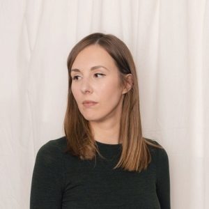
Customer in the spotlight: Studio 19.09

Who gets to say it better than our customers themselves? Therefore, we are happy to let them speak wholeheartedly at this place. About themselves and about us, because every project is teamwork!

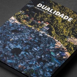
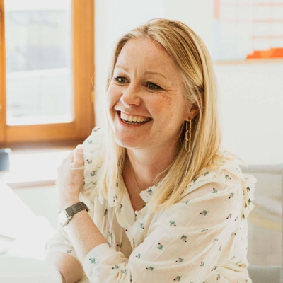
Several years ago, Nathalie Van Durme was working as a graphic designer for BO Magazine, our top lifestyle magazine. It was during this period that she also started Studio 19.09, a freelance project that has since grown into a full-fledged branding and design agency. Today it is three creatives strong and simplicity, clarity and character are typical. Pearls from the portfolio that might ring a bell? Lunch hotspot Barchel in Antwerp, handbag label Commori and interior design store Tillborg in Brasschaat.

What can interested parties expect from Studio 19.09?

Studio 19.09: “We help startups, entrepreneurs and companies tell their story using a strong visual overall concept. In other words, we build the brand from a to z, with everything that goes with it. In this, we go as far as necessary. From the complete corporate identity and logo to a website, signage and even interior and product design. For each aspect, we appeal to the right people, internal or external, with the goal of bringing the message to life in the most inspiring way possible.”

That means you have to know your customers inside out?

Studio 19.09: “True. I am a people person myself and that is strongly reflected in the way I work. My approach is very personal. I want to get to the bottom of people, because I believe that a good story can only be told if you know what lies beneath the surface. Who is behind that face? What is that person’s philosophy? What clothes is he or she wearing? You take that info and values into your concept. The nice thing is also that the people I work for are usually very passionate. That inspires enormously.”

How can print contribute to that overall story?

Studio 19.09: “I am not satisfied until every aspect is right and everything is aligned correctly. Details make a design. The same is certainly true of printing. Our designs often have a very personal touch, which I want to see reflected in the tangible version. It is important to me that the printer thinks along with me, and I experience that enormously at Buroform. There is very personal work, which is not only unique for a larger printing company, but also just makes your own work better.”

Which collaboration are you most proud of?

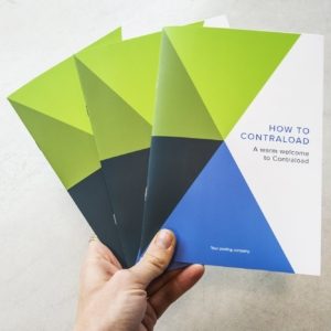
Studio 19.09: “For Contraload, I created the corporate identity. The printing was done by Buroform and that collaboration went wonderfully. I introduced the company myself and everyone was immediately on the same page. Another nice little project is Tillborg, where the printing also contributes very much to the overall experience. In the design, a pinkish orange and royal blue are the core colors. These had to be reproduced as faithfully as possible in the printed matter, and that worked out excellently!”

More of this: follow @studio19.09 on Instagram.

Personalized printing for Contraload

Contraload ‘s new stationary is a reality, and we at Buroform are quite proud of it. The company is the European market leader in pooling solutions for plastic load carriers. Consider plastic pallets, drums and bins. The beauty of their story: Contraload starts from a vision of corporate social responsibility, and aims to optimize international transportation and make it more environmentally friendly.

The Aartselaar-based company now has branches in the United Kingdom, France, Spain, Italy, Poland and Turkey. They all need personalized printing according to set corporate identity rules. And that, of course, is right up our alley.

The precise integration of colors, fonts and other elements, we attach enormous importance to that.

Personalized printing showcases new corporate identity

Recently, Contraload’ s visual identity underwent some changes. The company was given a new corporate identity in collaboration with Studio 19.09. Features include a custom font and different shades of green and blue, which are also reflected in the geometrically shaped C of the logo.

In every name card, every flyer, every presentation folder you will find the corporate identity, while the printed material is also personalized for each branch.

The Contraload logo in 3D varnish

That creative injection also affects what we do, of course. Because a new corporate identity, that means new guidelines for printing. The precise integration of colors, fonts and other elements, we attach enormous importance to that. Each name tag, each flyer, each presentation folder follows the newfound corporate identity, while the printing is also personalized for each branch. In fact, Contraload uses our platform BAAS. This ensures that the communication of each branch follows predetermined templates, i.e. in line with the corporate identity.

Update regarding coronavirus

Dear

Developments around the coronavirus are happening at breakneck speed, affecting everything and everyone. Therefore, also a note from Buroform. For here, too, all kinds of efforts are being made to stop the spread of the virus.

Nothing is obvious these days, everything is questioned. We too try to assess the situation and anticipate what is coming. One thing is indisputable: we must be there for each other, because solidarity is the only way to watch over everyone’s well-being.

Therefore, we too have taken a number of measures, in line with the opinions of the Flemish Government:

Unfortunately, we are forced to drastically reduce the team, 65% of our employees are home under economic unemployment due to force majeure. In order to ensure that the healthcare, food and necessary information carriers are supplied with the necessary printed materials, we continue to operate with a limited team.

Production

– Our production is running at 30% of capacity.
– We make every effort to avoid any physical contact.
– Orders can be picked up by name in our patio. Signing off is not necessary.

At the office

– We can be reached by phone continuously between 8 a.m. and 5:30 p.m., including during lunch breaks.
– Your contact in order support continues to follow up requests closely.
– Strict hygiene rules apply to all our employees: everyone must keep at least 1.5 m away and wash hands with disinfectant gels. Joint gatherings such as meetings, lunches and drinks we avoid at all times.

Delivery services

Our courier services work under a tightened protocol to avoid any contact. Each courier will ask you to sign for yourself so that you do not come into contact with him/her or his/her equipment.

Questions?

The current situation raises many questions. Feel free to ask those! Every uncertainty is one too many. So be sure to let us know if we can help you. Kristel, Inge, myself and all other colleagues are available to you via their direct number or email.

– Inge Cools: +32 15 288 994
– Kristel Verhaegen: +32 15 288 999
– Jesse Marynen: +32 472 72 94 74

A heart to heart

Currently, much seems hopeless, but we must also remember that the measures are temporary. Try to remain calm, level-headed and positive. Together we can limit the damage as much as possible, and that’s a lot.

So let’s fight back hard and make the efforts needed. And yes, we’re going to get that right. From all of Buroform, we wish you all the courage to keep going for it!

Kind regards
Jesse Marynen

FAQ

  1. Will Buroform remain accessible?
    Our offices are closed to visitors. We do remain available by phone.
    You can also email hello@buroform.be at any time . Mailboxes are monitored on an ongoing basis.
  2. Will my current order still be delivered?
    Buroform remains operational, albeit with a more compact team. Each order will be handled and delivered, possibly with some delay. We contact you in advance to coordinate your accessibility.
  3. Can I still place a new order?
    We provide limited permanence within our administration and production. That is, every application will be processed. You can always address your request to inge@buroform.be.
  4. Our people are present in the office, yet the driver does not ring the doorbell. How does this come about?
    While virtually everyone in our country is asked to stay indoors, our drivers are among the small group who must go outside to work. We cannot thank them enough for this. If it is not clear to the driver upon arrival whether a business is open, he may not ring the bell. Together, however, we can change this. Ask your professional clients to fill out this template and hang it up. Using a few simple instructions, you make it clear where the driver can go. This allows your packages to be delivered in complete safety.

Customer in the spotlight: Studio Posen

Who gets to say it better than our customers themselves? Therefore, we are happy to let them speak wholeheartedly at this place. About themselves and about us, because every project is teamwork!

Sophisticated, minimalist yet warm. What Studio Posen conjures out of the hat is a feast for the eyes every time. This creative studio is the brainchild of Kristel Posen, an architect by training but professionally grown into a graphic designer. Around her she gathers a multidisciplinary team of creatives and together they put brands on the map. From logo to corporate identity, social media to website and much more. Studio Posen develops everything needed to visualize your story or message and bring it to life.

How did you get in touch with Studio Posen with Buroform?

Studio Posen: “A long time back I had birth announcements printed with you for a client. I was suitably impressed by that. The quality of the printing and foil printing was impressive. When I needed some items for a recent project Labelchic, I didn’t hesitate. I contacted Valérie, who immediately invited me for an interview. “Then you get a much better idea of the possibilities,” it sounded. I found that quite disarming. At a lot of printing companies, orders soon run through mail. That works, too, but you never get as much information and inspiration as during a face-to-face meeting.”

What makes Buroform stand out for you?

Studio Posen: “The warm contact. Buroform really invests in its clients. That personal touch makes you much more likely to return. I now know that I get advice when I knock on your door, that every contact is a new discovery. There is so much knowledge, there are so many opportunities for advice, and everything with a smile. That’s a huge plus.”

What is the importance of good printing to you?

Studio Posen: “The first impression is everything. Print materials help determine the reputation of your brand. When a potential customer gets their hands on your magazine, its quality helps determine how that man or woman will feel about you. Well-crafted printing helps connect with your target audience. It helps to make your message tangible, to give it more power.”

How do you see the relationship between designer and printer?

Studio Posen: “Good printing is simply a necessity for the right perception of your designs. In addition, a good printer fills in the technical knowledge you lack yourself. After my first conversation with Valérie, she arranged for several paper representatives to visit our studio. That way your world expands, you discover new avenues, you learn. I found it fantastic that you took the time to bring those people to me. It’s also initiatives like that that make you stand out as a printing company.”

Check out the full case of Labelchic, Tache de beauté and Studio Posen.

What a Warmest Week: thanks to everyone who participated

Around 700 booklets sold, nearly 3,500 euros in profit. Our Warmest Week campaign was a huge success. And for that we can’t thank you enough!

If you follow our social media channels closely, you couldn’t miss it in late December: you were inundated with teasers and calls to participate in our Warmest Week campaign. We created this as a show of support for our colleague Johan Vloeberghs († July 2020). He was stricken with pancreatic cancer last year, something that greatly affected us all. A colleague facing such an illness, we just had to do something for that.

Eco notebooks

With Kom op Tegen Kanker as our charity, we designed hundreds of A6 notebooks made from surplus paper from our print shop. Together we all collected, cut and glued recovery paper to make as many copies as possible. With results, as the response and expressions of support were overwhelming. In just a few weeks, as many as 685 booklets went out the door. The total yield? 3,425 euros, to be exact!

In the meantime, how is Johan doing?

We are hopeful! Currently, Johan has just over half of his chemo treatment behind him. By summer that would be all over, after which he could further recover from last year.

A warm thanks to everyone

Our Warmest Week action was shared massively. We received tremendous messages of support and, of course, the proceeds exceeded our wildest expectations. We cannot thank enough everyone who participated in our action in one way or another. It is only thanks to you that we were able to make such a wonderful contribution to Kom Op Tegen Kanker!

_

Update:

Unfortunately, we come with the sad news that in July (2020) we had to say goodbye to our dear colleague and friend: Johan Vloeberghs. After a year of hard fighting he lost the battle against his terrible disease. Until the last moment, he fought to survive, but the disease was stronger than himself. Far too young, a wonderful man, husband, father and colleague. He was. We are going to miss him so very much. Our support goes out to his wife and children, to his parents, friends and acquaintances.

Meet the Buroform crew: David Geelen

Buroform is a diverse team brimming with talent. Wondering what it’s like to work with us? Then take a look behind the scenes. Meet David Geelen, Project Manager.

David Geelen

Hello, I’m David, father of two and from a family of advertisers, creatives and graphic designers. I have now been working in the printing industry for twenty-two years, five of them for Buroform.

At Buroform, I am responsible for…

About five years ago I started at Buroform as a graphic designer and DTP person, but over time that role has expanded tremendously and become more diverse. I am a project manager, responsible for our larger clients who need more than just printing. This could be POS displays or other promo materials, visuals or illustrations, stickers, the decoration of a store, you name it. They can come to me with any question and I provide a solution. I direct and arrange everything. I even go along to set up displays or help put labels on paint jars and such more. A real friendship relationship has developed with many clients over time, which allows me a lot of freedom and allows my creativity to run wild. In the end, you can describe my job very simply: I do everything I can to make our clients score, to get their brand noticed in the best possible way.

I got my job at Buroform through…

I studied graphic design at St. Luke’s and have been working in the industry ever since. I have been a graphic designer and art director in some advertising agencies, and worked briefly in a digital printing company. At one point, a friend of mine quit his job at Buroform to leave for a trip around the world. He then proposed me to management as a possible successor. My first project was one for Kellogg’s. That went well and since then everything has moved very quickly.

My morning ritual is…

Getting up with a good cup of coffee. Or more than one. I can’t live without it. Other than that, I go through the news and entertain the kids once before braving the traffic jams towards the Buroform offices. Once I arrive, I walk through my emails, create my daily schedule and take a long look at production to make sure everything is understood. Then the real work can begin and I handle my files according to urgency.

A typical workday is…

Hectic! I do that to myself a bit, I must admit. I always try to be available to customers. If anyone sends an email, I will reply as soon as possible. This, of course, causes me to constantly roll from one thing to another. It may sound chaotic, but for me it works that way.

What people don’t know about my position is….

I am very perfectionist by nature, which makes me perform all my tasks to the extreme. Every assignment I treat as if it were for myself. I put myself in the customer’s place every time. How would I like to deliver this project myself? That’s my starting point, that’s where I set the bar for myself. When I’m working on something, it’s hard for me to let go. It has to be right first, only then can I go home. I even help pack so that everything can still leave for the customer on time. Or for an order for complex POS displays, I meticulously draw the whole picture for the suppliers, so they know perfectly what to do.

The moment I am most proud of at Buroform is….

There are several, without needing to sound smug. But some projects I am proud of. I think of Kellogg’s, for which we and Buroform once stickered the entire interior with Tony the Tiger figures in various positions. I collaborated on that concept and drew all the illustrations myself. The response then was overwhelming. That includes projects by Hino, Wellpet and Scania.

What I like most about working at Buroform is….

Freedom. That allows you to take many things into your own hands and achieve great results that sometimes were not anticipated. There is always a challenge waiting for you and that keeps the job particularly exciting. In addition, I love the atmosphere here immensely. At Buroform, there is work to be done, but there is always room for a dose of humor. There is a hands-on mentality, which makes for a very positive vibe in the workplace!

On weekends you’ll find me…

Then I enjoy the free time. Over the weekend, I turn the switch all the way around. Then Buroform is on hold for a while, and the focus is entirely on my friends, family and children.

If I wasn’t a “graphic designer/project manager,” I’d be…

My spouse is from Japan. Should I not do what I am doing now, I would move there and open a steakhouse or a Belgian beershop. Not a weekday thing, I would go all out and make something really original.

The best career advice I have ever received….

Just being yourself. I think it’s hugely important to show who you are and what you can do. Be honest with yourself; that will get you the furthest.

Stay tuned. We continue to share stories about each member of our team. That’s how you get to know what it’s really like to work at Buroform.

Would you like to be part of our #Buroform team? Then take a quick look at our job openings and there might be something for you.

See you soon!

Everything you give attention to grows: 4 sales tips from Jesse

Jan Roel has been researching the success formulas behind sales for 23 years. In his podcast RED-Selling, he regularly gives the floor to the best in the business. In early February, Jesse Marynen also got a chance to explain his insights on that theme. We summarize the interview in four statements, with expert commentary from our manager. Curious about the full interview? Just scroll and you’ll find it at the bottom of the page!

Jesse at the table with sales expert Jan Roel van Rhee.

1. It’s not your product that matters, it’s what your customer needs

“In the past, when I was still working as a salesperson myself, I used to pull up to the customer with a showcase each time: ‘Look what we can’t do.’ Now I realize that such an approach is actually counterproductive. By imposing your product, you miss the point. Namely that you must first and foremost listen to what your customer needs. His wish or need is your starting point. Only when you know that, then you can start showing the best of yourself with a personalized portfolio, if necessary.”

2. Really get to know your customers and make connections by letting them have their say

“As a salesperson, you are dealing with people. That’s exactly why you need to know who is behind that face. Prepare yourself well. Who do I have in front of me later? What has this person studied? What else is he/she working on? We live in a digital age. All that info is there for the taking. Google briefly, check LinkedIn, there are so many tools available to make a deeper connection from the first conversation. Make sure your customer is speaking and not you. To project it onto everyday life: when someone gives you the chance to tell your story or share your emotions, it still makes you feel incredible. That’s what I mean.”

3. Also learn to say “no” when you have to

“There is a lid for every pot. For every question there is an answer, but that doesn’t mean you always have to look for it in yourself. Sometimes you have to learn to say no. I myself am the best example of that: I always want to help everyone, when that is just not possible. Sometimes there are other people or companies who are better placed to help. Dare to express that too: half-hearted work is of no use to anyone.”

4. Treat your customers with the same care as your loved ones

“Today, every printing company is a top printing company. Everyone has modern machinery, offers super service and delivers quality. You distinguish yourself above all in human terms. By giving customers the feeling that you are really there for them. ‘Everything you give attention to, grows,’ I always say. Because there is so much truth in that phrase. In that view, customer loyalty is a lot like a love relationship. You have to keep caring for each other. If you stop paying attention, someone else will.”

Listen to the full interview?

Check out the podcast via Spotify.

Or watch it all in words and pictures via YouTube.

Customer in the spotlight: studio basil.

Who gets to say it better than our customers themselves? Therefore, we are happy to let them speak wholeheartedly at this place. About themselves and about us, because every project is teamwork!

studio basil. is a branding agency in Brussels, founded by Ann-Sophie Maeyaert. She graduated as an interior designer, but after her studies chose to pursue an alternative creative path. She moved to London, studied graphic design and then worked in several agencies and as a freelancer. The latter activities also gave birth to studio basil. which she transferred to Brussels about two years ago. The agency operates mainly in the retail and hospitality sector, creating visual identities grafted onto a strong overall concept. “We assist companies in developing their entire corporate identity. That can go a long way, from coming up with a name and working out a logo, to the overall branding strategy, product development and so much more.”

How did you get in touch with Buroform?

“I only moved from London to Brussels two years ago, so I’m still honing my network. At some point online I stumbled across a number of Buroform projects. All of them very nice things that triggered me to have a listen to see if something was possible together. That’s how I came into contact with Valérie, your printing expert. I must say: that meeting blew me away. Valérie was immediately on board with my story. She exudes enormous knowledge, insight and enthusiasm, which is very inspiring.”

What makes Buroform stand out for you?

“I think customer friendliness is incredibly important. Buroform puts a lot of effort into that, you notice that in everything. And furthermore, the company simply exudes trust and that is after all the basis of all collaborations. I know I can count on your people, a feeling that was only strengthened after the first collaboration.”

What is the importance of good printing to you?

“My work hinges on beautiful, quality print work. You never get the same effect on a screen as you do on paper. Every design has a certain layering. You are trying to convey your message or that of your customers in various ways. Good printing shows those different layers. It also makes all the details you’ve thought about for so long become tangible. Color combinations, a certain type of paper, a printing technique, they ensure that your design is experienced as intended.”

How do you see the relationship between designer and printer?

“The connection between a graphic designer and printer is crucial. As a designer, you have some technical knowledge, but you never know everything. On the contrary. A printer who can share knowledge is a huge asset. I had that experience with Valérie. She is very knowledgeable. The knowledge you gain by consulting, by working together is priceless. It allows you to take different paths. You can suggest things to your own clients, your own designs become better, because you gain insight into new things. From that point of view, an initiative like Café Cliché is very important. Such moments of inspiration ensure that you keep learning and discovering as a graphic designer.”

HP Indigo 7900: more freedom for your printing

Our print shop welcomes a new printing press and that is great news. The HP Indigo 7900 is a lightning-fast automated sheetfed press that enables us to deliver even more beautiful print products. More to the point, it allows us to further optimize the balance between price, delivery time, durability and quality, so that you get even better service.

An inkjet you know. It probably shows off on your desk, too. As a printing company, we are taking a few steps further with offset and digital presses. They print either through a light-sensitive plate or through a thick layer of ink on paper. Well, on the tangent between those three, is the very latest addition to our machinery: the HP Indigo 7900. Through dozens of innovations in software and hardware, this press produces the sharpest prints in the industry. Whether it even matches the quality of an offset? We are inclined to say it does.

General information about the HP Indigo

Highly accurate recto-verso

So what makes us so impressed with our newest addition? First, there is the registration: this printing press registers itself how much ink to use and how many times the paper has to pass through the machine. Typically, several layers of ink are needed for the colors to come out perfectly. The paper then has to go through the press several times. But paper also moves in the machine, which can cause multiple layers of ink not to flow together nicely. With the HP Indigo 7900, this is no longer the case. In fact, this printer works with grippers, just like an offset press. They ensure that each layer is extremely precisely overprinted: the paper always stays nicely in the same place, so that different ink layers come together perfectly. Recto-verso printing is thus done more accurately than ever before.

Lifelike PMS colors, even white

Thanks to the HP Indigo 7900, we are able to print any PMS color. In fact, the color range is wider than that of any offset printing press. The printer features seven ink stations instead of the standard four CMYK colors cyan, magenta, yellow and key. This allows us to produce up to 97% of PANTONE® colors. Also in terms of “spot inks” and “one shot,” we can recreate these colors lifelike and everything can be done in one motion. In addition, the HP Indigo 7900 enables premium white printing. This is because the white ink is as opaque as screen printing ink, which means that white will really be white. Do you prefer fluorescent, transparent, silver or insightful ink? The color possibilities are endless.

Printing on any material

The HP Indigo 7900 works with liquid ink technology. Through laser beams, a thin layer is attracted and secured to the material being used. This leaves the structure of the substrate completely intact. Underground? Yes indeed, because we can print on more than just paper: canvas, cardboard, you name it. In addition, we work with HP certified paper, produced and tested at press size. An additional advantage: the paper causes as little damage as possible to the machine itself, which increases its lifespan and reduces expenses and maintenance.

Full automation

The HP Indigo 7900 is the industry’s most scalable high-performance print server that is fully committed to automation. Your product is completely handled digitally, making the whole process much more efficient. Not only are delivery times reduced, we are able to keep production costs lower. In fact, the control program automatically calculates which press is the most economical for your printing. In addition, there is advanced color automation that ensures accurate and consistent standards-compliant color: again, time- and cost-saving. Also, our Adobe software is being upgraded for multiple printing options. For example, you can combine different design elements or have different versions of one image printed in the same breath.

Environmentally friendly and sustainable story

Sustainability is also an important factor. The HP Indigo 7900 has the Intertek Green Leaf Mark and is produced carbon neutrally. It also generates less aval, is energy efficient and offers a supplies return program. So that way we are doing our part for the environment.

This HP indigo offers a world of new possibilities and that close to home. Curious about what it can do for you? Connect with us and discover these new features for yourself.

TECHNICAL SPECS

Print speed
120 four-color A4 pages per minute (2-up)
160 A4 color pages per minute in EPM (2-up)
240 two-color or monochrome A4 pages per minute (2-up)
Image resolution 812 dpi at 8 bits
addressable: 2438 x 2438 dpi HDI (High Definition Imaging)

Media format
Maximum 330 x 482 mm
Image size Maximum 317 x 464 mm

Paper weight
Coated: 80 to 350 gr/m²
Uncoated: 60 to 350 gr/m²
Thickness: 70 – 400 microns

7 colors
Cyan, magenta, yellow, black, orange, violet and green

Ink for special effects
Digital matte, fluorescent pink, invisible red, light black, light light black, light cyan, light magenta, white

HP IndiChrome off-press spot color ink HP
IndiChrome ink mixing system (IMS) for creating spot colors with CMYK, orange, violet, green, reflective blue, fluorescent red, bright yellow and transparent

PANTONE® colors
Supports PANTONE PLUS®, PANTONE MATCHING SYSTEM® and PANTONE Goe™, HP Professional PANTONE emulation technology in press with CMYK,
HP IndiChrome off-press (IMS) to produce up to 97% of PANTONE® colors,
HP IndiChrome on-press,
HP IndiChrome Plus on-press.

Options
Printing on synthetic material,
Use of cardboard up to 400gr/m2/460micron,
Addition of white ink.

Dualidade: Brazil as a country of extremes

Over the past five years, photographer Frederick Van Grootel has visited Brazil several times. He has now captured his experiences and impressions in a beautiful coffee table book. ‘Dualidade‘ zooms in on the fragile beauty of the country and the contradictions hidden behind every corner.

“The contrast of the painter bringing an idyllic landscape to life and the reclining pose of the wanderer exemplify what I saw in Brazil.”

It was the typical journey of a young twenty-something. Getting away from it all for a month, seeing and doing something totally different. In 2015, Frederick Van Grootel visited Brazil for the first time. He would attend an international music festival there with a friend, have fun and soak up the Brazilian atmosphere and flair. In between, he would also photograph the land. So Van Grootel fell under the spell of the language and culture, and they have never left him. Every year, the photographer spends at least a month in the land of the Samba, documenting all that crosses his path. A precipitation of all that footage he released in book form under the title “Dualidade,” which literally translated means “duality. It outlines Brazil as a country of extremes: wealth and poverty often go hand in hand.

Frederick during a photo shoot in Sao Paulo

Laureate Brussels Street Photography Festival

It was thanks to the image of a street painter and a vagrant that Frederick Van Grootel’s work first came to real attention. In October, he became the laureate of the Brussels Street Photography Festival, where he snagged the audience award. “That picture forms the perfect synthesis of the book,” says the photographer. “It is an image as funny as it is poignant. The contrast of the painter bringing an idyllic landscape to life and the reclining pose of the vagrant are exemplary of what I saw in Brazil.”

Behind the scenes at printing company Buroform

It took a while for Van Grootel to grasp the theme of his book. In 2018, he volunteered to teach neglected and abused children from a favela in Rio de Janeiro. After working there for two weeks, he took the bus to a birthday party just down the road. “It was harrowing. In the same breath, I switched from kids struggling to have money for breakfast to young people drinking whiskey from the bottle at a rooftop pool party. From that moment on, the puzzle fell together for a big piece. I was in shock at this huge contrast. This was the story I wanted to tell. Brazil is a country of extreme wealth and beauty, but at the same time it is poor and vulnerable. You find this dichotomy everywhere, often within a sigh of each other.”

“The paper has the perfect thickness and makes the colors and contrasts of the photos stand out beautifully.”

Collaboration Buroform

Van Grootel’s work can be recognized by its use of pronounced colors and contrasts. The book is printed on a very tactile paper that makes the images stand out perfectly. “It came about in collaboration with graphic designer Tina De Souter, who guided me through a lot of things. Through her, I also came into contact with Buroform. ‘That’s where you should be,’ she convinced me. Your printing company did a perfect job. Tina and I had a very specific idea of what the book should look like. But in terms of paper choices, printing techniques and binding, some additional expertise was welcome. The paper has the ideal thickness and lets the colors and contrasts of the photos stand out beautifully. The binding makes the book fall open very nicely. The latter in particular seems like the most normal thing in the world, but I’ve had other experiences as well. This collaboration was definitely a breath of fresh air.”

For more information: https://www.frederickvangrootel.com/book