A new year in sight. By time-honored custom, that means an influx of Christmas wishes and good intentions. Well, this year we’re just doing it differently. Our team has an alternative Christmas and year-end message for you. Not words, but deeds! And a Santa hat here and there in surplus. Happy holidays!
https://www.buroform.be/buroform/assets/media/DAVID_square.jpg10801080Julie Van de Weerdhttps://www.buroform.be/buroform/assets/media/logo-buroform.svgJulie Van de Weerd2019-12-18 10:52:282023-02-13 14:35:31A year in high resolution
Christmas and New Year are coming up. So it’s high time to dive once again into the most original Christmas wishes. After all, how do you create a personalized Christmas card that stands out, inspires and feels genuine? Four tips to surprise with unique year-end printing.
Know who receives your Christmas card
Original Christmas wishes are different for everyone. How close are you to the recipient? Have you worked together intensely in the past year? Does that collaboration evoke memories or accomplishments you want to revisit? What personality does that person have? The answer to those questions determines the tone and content of your message. Do you go for a very personal touch or do you prefer to keep it professional: only you can sense that.
Original Christmas wishes? Use humor
Wordplay. They work. Even if they sometimes sound a little forced, they provide a lighthearted tone to your text. A touch of humor always releases more than a standard message. It’s okay to thank a construction partner for a constructive year. A client from the hospitality industry likes to read how your teamwork is the recipe for success in the future. Because that’s what it’s all about: you show commitment and demonstrate that you greatly value your client’s expertise. Small note: humor comes in different degrees. Jump in handy.
Inspire with an appropriate quote
On Pinterest and Google you can find them with heaps. Quotes are an easy way to get your message across. There are hundreds of famous and less famous sayings circulating on the net that you can use to create original Christmas wishes. Important: make sure the quote you choose also effectively connects with your client’s story. She just makes your Christmas card more personal.
End-of-year printing? Be there on time!
Once you know what you want, all that’s left is the effective elaboration of your Christmas card. Extra tip of the house: get there early. The holidays are traditionally a busier time, with consequent longer wait times. No idea what you want? Get inspired in advance or connect with us. We make sure your wildest plans become reality.
https://www.buroform.be/buroform/assets/media/kerstkaart_merry_christmas_kerstboom_eindejaarswensen_211d07bf196497ed49909a135a57e67e_2000.jpg13352000Julie Van de Weerdhttps://www.buroform.be/buroform/assets/media/logo-buroform.svgJulie Van de Weerd2019-11-04 18:45:032019-11-04 18:45:03Original Christmas wishes: say it with unique end-of-year printing
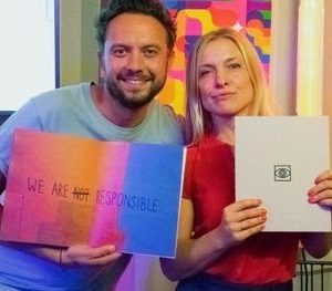
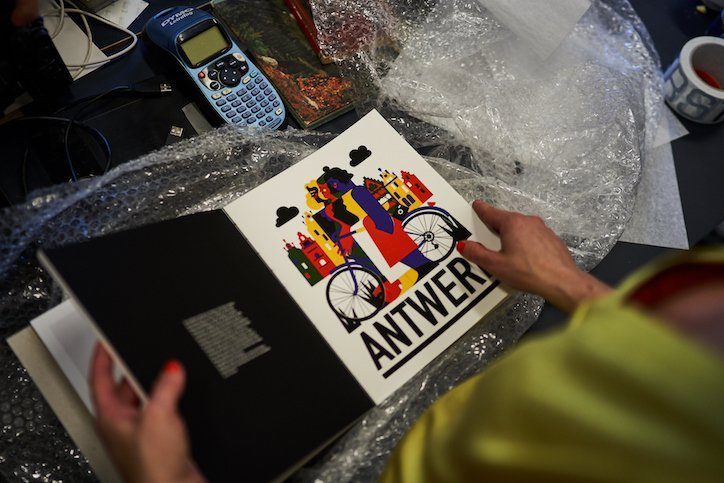
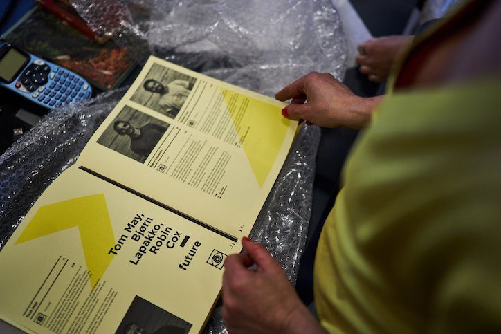
With a sublime art book, This is Antwerp celebrates the fifth edition of D.A.T.E., an annual week-long bootcamp in Antwerp’s creative scene. We provided paper, ink and an exclusive binding to finalize that piece of art.
‹
›
A beautiful art book. With it, This is Antwerp celebrated the fifth anniversary of D.A.T.E., an initiative that brings together a dozen or so creatives from around the world each year for an exploration of Antwerp’s artistic scene. Of all the photographers, artists, designers and bloggers who have already passed the review, twelve were invited again in 2019. They compiled their impressions into an exclusive coffee table book: 160 pages of photography, illustrations, interviews and notes form an extraordinary representation of Antwerp as a creative city.
‹
›
‹
›
D.A.T.E. art book according to four themes
For this anniversary edition, the twelve dove even deeper into the local scene, far off the beaten path. From Monday to Thursday they went out during the day, in the evening they met to translate their impressions into the pages for the D.A.T.E. art book. For this, they were split into four teams according to a well-defined theme: design, art, technology & innovation and subcultures. Those themes are the common thread throughout the book. “We spent four evenings and nights working on the book,” says graphic designer An Eisendrath, who handled the overall design and prepared the supplied material for printing. “The result is a wonderful collector’s item that uniquely captures all the experiences, impressions, stories and encounters in words and images.”
Creative solutions within timing and budget
In late September, the book was presented at the creative event Us By Night. The cover consists of a simple gray cardboard. At the front is the logo of D.A.T.E. incorporated in black foil, at the back that of This is Antwerp. The effect is minimalist yet nuanced. Two completely different papers were chosen for the interior. The intro pages were printed in black and white on yellow uncoated paper, while the work of the 12 participants comes to life on a white fully-coated version. But what especially gives the book its artistic character is the open binding in which yellow once again takes a prominent role.
‹
›
“Working out the book has been an intense process,” says An Eisendrath. “We were on tight timing and a limited budget. In addition, we had some very specific requirements that turned out to be far from obvious. The way solutions were sought to make everything rhyme perfectly is exceptional. The end result is beautiful, but first and foremost I keep a very personal feeling from this collaboration. The commitment and dedication of someone like your print expert Valérie is rare. I have never worked with a printing company that was so close to design. Every aspect has been considered. Each question was rooted for until there was an appropriate answer. Such a follow-up: chapeau.”
https://www.buroform.be/buroform/assets/media/c66a2b2fe5e6b5fc0f63fb309ea51952_a7a152a8632a807fcea529611a8b6be0_2000.jpg263562Julie Van de Weerdhttps://www.buroform.be/buroform/assets/media/logo-buroform.svgJulie Van de Weerd2019-10-23 16:19:062019-10-23 16:19:06D.A.T.E art book offers alternative view of Antwerp
A personalized year-end gift strengthens the bond with customers, partners and employees. The best example: a personalized desk calendar. Obsolete? On the contrary, if you handle it correctly at least. Because how do you make your calendar totally convincing? How do you make your attention feel real and genuine? Five tips, as a year-end gift from us.
Order year-end printing? Get in touch and we’ll get you a quick quote!
Keep an eye on your target audience
Not unimportant: to whom will you gift the calendar? Sales people or office workers, for example, they function in a very different way. One group spends its time mainly in the car, while the other moves mainly between its own four walls. So think about the format of your desk calendar: will you go for a smart pocket version, a creative wall calendar or a wonderfully authentic desk calendar? Determine the form first, then think about the content.
Don’t make your desk calendar too commercial
It’s all about the attention. Through the calendar, you show appreciation and confirm the fruitful collaboration between you and your employee, supplier, partner or client. Of course, your logo and contact information may be subtly visible, but don’t flaunt it. What matters is the gratitude your promotional gift exudes: you are happy that that person is part of your company.
Provide a visual gem
What gets your audience hot? Respond accordingly. Choose a theme that you know will touch you. In addition, make sure you have a visually strong concept. Beautiful images appeal, colors work as well. In doing so, focus on what resonates with your target audience. Consider photos with meaning, emphasize common accomplishments, feature colleagues, provide a personal touch by printing the recipient’s name on each page. If you think a little off the beaten path, you soon have several options for doing something special.
Design: Studio Posen
Consider a premium finish
There are countless different paper types and thicknesses, printing techniques, forms of finishing. They make your calendar look as simple or extravagant as you like. One tip: make sure the finish of your printing is a nice translation of your company’s style. A corporate gift remains a form of branding, keep that in mind as well. In addition, pay attention to practicality: choose paper that is convenient to use or at least easy to write on.
Design: Kris Demey
Highlight important dates
Give your client or employee a hand: dot important dates so the recipient knows immediately when vacations fall, events or outings are scheduled. Of course, the dates indicated must be relevant. And the recipient must have a message for it.
Got enough inspiration? Ready for the real thing? We execute your ideas to perfection. Still a question here and there? Pop in, have a coffee with us and we’ll tell you everything you want to know. Connect with us through Sarah or Kelly.
https://www.buroform.be/buroform/assets/media/metapaperevent-09_76c7a80b4c9cfd45bfc33766d58b0e2a_2000.jpg13332000Julie Van de Weerdhttps://www.buroform.be/buroform/assets/media/logo-buroform.svgJulie Van de Weerd2019-10-21 16:01:482023-10-26 10:33:43Desk calendar as an original promotional gift: this is how to score with customers
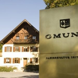
Along Lake Tegernsee, peacefully nestled between the Hohe Tauern and Nockberge national parks lies Gmund, a colorful medieval town focused entirely on art and culture. You will find numerous galleries, sculpture gardens and artists’ studios surrounded by green hills, plateaus and hiking trails. This is a place where you come for artistic photography, authentic crafts, painting and sculpture, as well as the Büttenpapierfabrik Gmund. Just beyond the village center, in the shade of pine trees, is a honey-colored building where paper is also elevated to art.
All visitors are warmed up for the day trip inside the Gmund paper mill.
Gmund Paper since 1829
In mid-September, we went to sample all that beauty, along with paper partner Papyrus. The road to Gmund leads over green curved landscapes and stops at an elongated country house in typical Austrian style. Immediately it becomes clear what makes Gmund so unique. ‘Papierkultur seit 1829’ can be read on a golden welcome sign: the love of the trade overwhelms you even before you pass the driveway. Gmund may be the world leader in natural papers, it may employ 140 people, but it has also remained a family business in the true sense of the word.
Jesse Marynen: “Extreme know-how goes hand in hand with warmth and conviviality. You feel that from the moment you set foot here. The passion radiates through all aspects of the company. Everyone you come into contact with has the same inspiration and conviction. Creating and producing paper is more than a craft, it’s part of an all-encompassing culture.”
Passion shines through in all aspects of the business.
‘
‘
‘
‘
In the production halls, countless papers are stacked on pallets, like a mosaic of colors.
Sustainable paper
Gmund Papier has existed for nearly two hundred years. The craft of the time is still at the heart of it. Still working with the same machines as then. Day in and day out, more than a hundred thousand different papers are brought to life, with great knowledge, skill and love for the craft. In the production halls, countless papers are stacked on pallets, like a mosaic of colors. Each one is produced in an environmentally responsible manner. Gmund generates 75 percent of all its energy itself, with no carbon emissions. In addition, each paper carries the FSC label, which guarantees responsible sourcing from sustainably managed forests and recycling. In terms of waste, Gmund even dives below two percent, 99 percent of which is also recycled.
“People again believe that high-quality print is a huge lever to get their story into focus.”
Jesse Marynen: “Gmund is a company with a story that is more relevant today than ever. By focusing on sustainability, it contributes to a healthier world, a fact that is also incredibly important to us at Buroform. In addition, the quality of the product cannot be matched. The versatility is enormous, which gives us an undeniable added value as a printing company. For example, you can choose from as many as 135 textures, each of which gives a different experience to printed matter. The fact that this paper mill is one of the few that continues to grow every year says it all. In addition, this growth is also an overall positive sign: people once again believe that high-quality printing is a huge lever to bring their story into focus.”
‘
‘
https://www.buroform.be/buroform/assets/media/Gebaude_auen_3_b5cea21bf95d3f1818d198d640e0b09d_2000.jpg471709Julie Van de Weerdhttps://www.buroform.be/buroform/assets/media/logo-buroform.svgJulie Van de Weerd2019-10-17 17:15:382019-10-17 17:15:38Visiting Gmund
We all live to the rhythm of the seasons. As a company, you also have to respond to this. As a company, how do you stay top of mind throughout the year? How do you keep triggering and consequently generate leads? Personalized printing allows you to tell your story in very diverse and surprising ways, in accordance with the time of year.
Grab the attention of customers and prospects, and then hold that attention for the long term. It takes time and effort. If you want to establish yourself as a company in minds and hearts, you have to keep feeding interested parties with information. Success comes with consistency and repetition. Staying in touch with customers helps maintain and deepen important relationships. More to the point: each season you need to adjust your communications to perpetuate contacts. We explain how to do that successfully using quality printing. Because, of course, every season calls for different concepts and designs.
Spring
Spring is a wonderful season. Day after day the light stays longer, flowers bloom open, trees shroud themselves in green, the smell of freshly cut grass rises back up for the first time. Darkness gives way to light, and you can use that atmosphere as a business. For example, why not hold your own spring festival? With an original invitation that convinces your clients of your creativity, candor and open-mindedness.
‘
‘
Or would you rather stay top of mind by promoting your product range in a seasonal brochure? The promo material for D&M Depot’ s new spring collection is a very good example of this: the style is understated, the tone cheerful, and that cheers a person up.
Summer
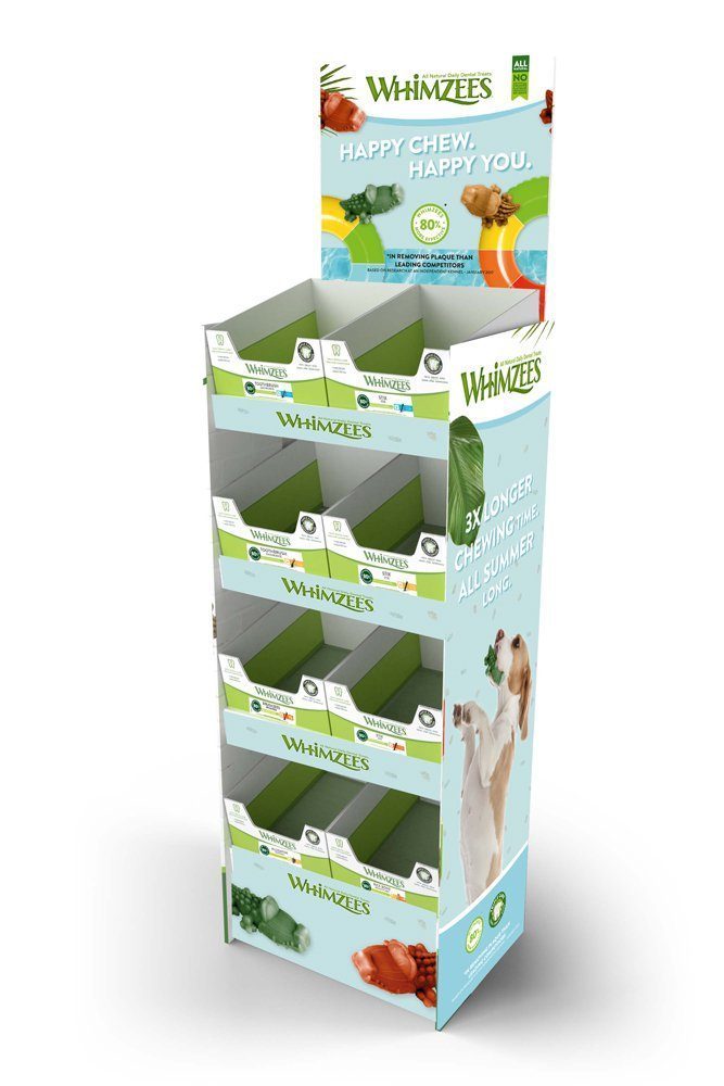
During summer, we live life to the fullest. That rising energy level invites more frivolity in your communication. People come out together, they take care of each other. They want to get that feeling from you, too. Fresh ideas and cheerful concepts demonstrate openness and generosity. A nice example is the campaign of Whimzees, which handed out free samples last summer: not only owners should be able to enjoy a tasty snack, but their four-legged friend deserves something extra under the sun as well. The message can be that simple, but it shows the company’s generosity.
This campaign was conceived and developed by us on behalf of Wellpett for Whimzees. For the displays, we worked with ecological materials. We can even say that 50-70% is made up of recycled materials. In this way, the company’s environmentally conscious thinking is carried through to the printed matter to the maximum extent possible.
‘
‘
With this display, Whimzees provides in-store promotion of its summer products. It is a convenient design with room for swatches that are immediately eye-catching.
Autumn
Autumn: the temperature gently begins to drop, the pumpkins come out, the landscape turns into a soothing palette of earthy colors. So time to put on your wool socks, settle into the couch and put a nice bowl of soup to your lips. Not to mention it’s also Halloween. How can you harness such an eerie atmosphere and generate leads with it?
A great example we worked out together with Keep it Quiet. It shows well how a creative idea with quality printing creates even more of an experience. For the promo event of the new recipe of The Kraken Rum, we developed this box as an invitation, completely in the theme of the brand. Inside is a small bottle of rum as a taster. Next to it, the invitee finds a dark envelope containing the invitation, beautifully finished with the distinctive tentacles of a kraken, which was lasered from black paper. Everything about the invitation exudes quality, taste and atmosphere, completely in line with the brand’s identity and values.
‘
‘
Winter
During winter, we seek warmth and affection. It is the time when the holidays bring us together cozily, a time of gratitude, looking back and looking forward. All those emotions can be captured in very different attentions for customers. A simple Christmas card always works, but why not gift a personalized wine box? Or a gift box with your own logo engraved on it and a notebook with a pencil as a handy accessory? When it comes to end-of-year printing, anything is possible. Moreover, personalized printed materials have been proven to increase awareness and response rates by nearly half.
‘
‘
These teaser cards were all about the season last winter. Using a special foil, we created snowflakes both on the printed matter and on the envelopes.
Giving the right gift at the right time. Buroform is happy to help you make that happen. Let’s get our heads together about it and create something that will permanently draw attention to your story. There are so many great ideas for staying in touch with your customers. Get inspired in advance by our print materials.
https://www.buroform.be/buroform/assets/media/wellpet-02_96fb2ef0d586947bece2df288075a6a6_2000.jpg13342000Julie Van de Weerdhttps://www.buroform.be/buroform/assets/media/logo-buroform.svgJulie Van de Weerd2019-10-07 16:40:022019-10-07 16:40:02How do you bring in leads in spring, summer, fall and winter?
In September, Buroform treated to the first edition of Café Cliché. Under the title Color Class(h), we immersed 50 creative people in the wonderful world of “color” for an evening. And whether that was a success!
Café Cliché is a night out for all those who enjoy a firm dose of creativity. We regularly organize inspiration moments where we dwell on printing techniques, paper types and other graphic goodies. On September 12, 2019, we threw open the doors of this ambitious new initiative for the first time. On the menu was the theme of “color. What do colors do to people? How do they influence our thoughts and emotions? And as a designer, how do you use them optimally in your own projects? Those questions flowed profusely and were provided with bite-sized answers.
Inspiring setting
Scene of the event was the hall of our print shop, which had been transformed into an intimate event space for the occasion. We had built a stage there, with several bar tables and stools in front of it. At the center was a table full of print inspiration from Buroform, Wibni and Colorplan, the holy trinity around which the evening would revolve. In addition, to push the sociability factor up a notch, we provided the necessary food and drink options. A food truck from Le Pain Quotidien brought in various healthy snacks, while Mi vino Su vino, a tasteful side project by our colleague Reshum Van Till, was thirst quencher on duty.
Café Cliché is a night out for all those who enjoy a firm dose of creativity.
G.F. Smith and Colorplan color evening
After our manager Jesse Marynen put the necessary flair into the welcome address, Lubos Bisto, International Paper Consultant of paper giant G.F. Smith, mounted the podium. He talked about “The World’s Favourite Colour Project,” the largest color study ever. Following this, our printing experts will highlight Colorplan’s endlessly varied paper range through case studies, sample designs and more. Name cards, notebooks, presentation folders, covers, labels, our colleagues flawlessly demonstrated the added value of the right choice of paper and printing technology in modern communications.
Presentation on stage in Buroform’s print shop by Colorplan and Wibni
‘
‘
Edition one successful, that much is certain. It was a top night in atmosphere, taste, experience and… color. We look back on it with pride and satisfaction. Here’s to a second successful evening and hopefully you too will be there!
https://www.buroform.be/buroform/assets/media/cafecliche_63_eca52e295d17747a2529c8797f03574d_2000.jpg13332000Julie Van de Weerdhttps://www.buroform.be/buroform/assets/media/logo-buroform.svgJulie Van de Weerd2019-09-30 10:27:322019-09-30 10:27:32Café Cliché x Color Class(h)
Variety abounds within the Buroform crew. Wondering what it’s like to work with us? Then take a look behind the scenes.
Jade Ooms
I’m Jade Ooms, passionate about letterpress and foil printing, and the only woman standing my ground within our type printing company.
Jade in typo printing. Her “valhalla” within Buroform.
At Buroform, I am responsible for…
Letterpress, foil printing and everything that comes with it such as die-cutting, creasing and perforating. I work as a type printer and operate the Heidelberg Degel, an artisan machine some sixty years old that is back burning hot today.
I got my job at Buroform through…
About a year and a half ago, I applied for a job here. I was then working at another printing company, doing exactly the same thing. But I was curious to see more. My eye fell on a job opening at Buroform, which even then was known as a growing and ambitious company within the industry. After a good conversation with Karel Marynen, it didn’t take long for me to start at Buroform.
Extra control is very important within this craft.
My morning ritual is…
I get up, prepare my granola and leave for Mechelen at leisure. I usually eat my breakfast in the car, oops. 😊
What people don’t know about my position is….
The machine I am working on dates from the 1960s. Letterpress printing is still a truly artisanal technique. Although today, of course, it is combined with digital capabilities. But nothing is automatic. Everything has to be set up manually, which can sometimes take a long time. Mounting the printing plate accurately on the press, stirring ink, placing film: these are jobs that require a lot of dexterity. The fact that I am one of the few women doing this makes the job extra special. Type printing is primarily a man’s craft anyway. Those at the controls today often have decades of experience. With me, it’s different. I am the new guard. The future. And a woman!
My proudest moment at Buroform is….
A while ago, we had a booth with Buroform at a wedding fair. There we presented the old Heidelberg degel that you still have to keep going with a pedal pedal. It is a unique machine, and apparently many visitors agreed. A lot of people were raving about our printing press. That I get to serve those does make me proud. When people look up to what you do day in and day out, you shine for a moment.
As a woman, I am proud to stand behind such an iconic aircraft.
What I like most about working at Buroform is….
The printing press itself. As a woman, I am proud to stand behind such an iconic aircraft. In addition, I particularly like the atmosphere in the group. Everyone goes for it, but that seriousness and commitment is also coupled with laughter and swag.
Jade behind the old degel during “Loving Marriage,” For Lovers’ wedding fair.
On weekends you’ll find me…
Not uncommon at a flea market! Not that I’m so into old stuff, but I do love the atmosphere at those markets immensely. Furthermore, the weekend is the time for me to be free: go out on a terrace, have a drink with friends… Just clear my head and enjoy.
If I wasn’t a “typewriter,” I’d be…
Teacher typo! A while ago I had to train someone as a type printer and that experience has stayed with me. Transferring your own skills to another person: I loved that. So look, who knows, maybe there is a teacher lurking in me somewhere 😉.
The best career advice I have ever received….
Career advice is not really it, but people have often pointed out to me how handy I am. I have always had technical understanding, the feeling to put things together. Ét voilà, I made that dexterity my job!
https://www.buroform.be/buroform/assets/media/drukkerij-47_4ba9f98369b2f9c909bc67f3b77efdbd_2000.jpg8001200Julie Van de Weerdhttps://www.buroform.be/buroform/assets/media/logo-buroform.svgJulie Van de Weerd2019-08-22 16:32:062019-08-22 16:32:06Meet the Buroform crew: Jade Ooms
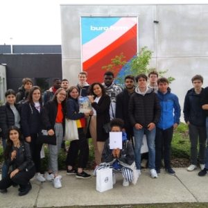
What exactly goes on in a print shop? The answer to that question was given to the fifth-year students of the Scheppers Institute Mechelen during a tour of Buroform. Project manager Johan Vloeberghs imagined himself in front of the classroom for an hour.
The Scheppers Institute Mechelen set out for a day in the Mechelen-North industrial park. In a handful of companies, fifth-year Economics students there were extensively introduced to different sectors. Buroform also enjoyed a visit. We had twenty-five students and two teachers over, who wanted to know all about the ins and outs of our print shop.
“Buroform is a company that focuses on quality, customization and good customer relations.”
What does working at Buroform entail and what is the personnel policy like? What about the competition? How does a modern print company deal with digitization and how will it affect the future? These and other questions were expertly answered by our project manager Johan Vloeberghs.
“Buroform couples the power of an enormously varied machinery with a thoughtful vision and warm corporate culture that radiates to all who come in contact with it.”
Thomas Derynck of the Scheppers Institute: “Buroform is a company that focuses on quality, customization and good customer relations. It does this successfully, which is far from obvious in a sector that is constantly evolving and in which there is a lot of competition. The students were impressed by what they got to see and hear. Some printing presses are more than fifty years old. Something like that obviously captures the imagination. Buroform combines the power of an enormously varied machine park with a well thought-out vision and warm corporate culture that radiates to everyone who comes into contact with it. Young people with an entrepreneurial heart can learn a lot from this.”
Would you like to visit Buroform? Connect with us. See you soon.
https://www.buroform.be/buroform/assets/media/Mechelen_Noord_2019_016_53e2443a0cf826536b9be8defe932cf0_2000.jpg12172000Julie Van de Weerdhttps://www.buroform.be/buroform/assets/media/logo-buroform.svgJulie Van de Weerd2019-08-19 17:15:572019-08-19 17:15:57Visiting Buroform: a printing company as a learning experience
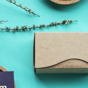
The highest quality message does good for the environment. With every decision we make, our green footprint thoroughly plays into our consideration. That’s why our creative experts developed these beautiful presentation boxes for name cards.
Environmentally friendly packing
Everything starts with the first impression. Beautiful packaging makes that first experience memorable. That’s why we chose FoldKraft™ paper from Papyrus. This paper immediately gives a unique, natural look and feel. Its high rigidity and tear-through resistance make this paper ideal for packaging, menus, greeting cards and labels. In addition, the evenly smooth surface on the front ensures optimal printing results.
Reduce environmental impact
By choosing this paper, we try to keep our footprint small. In fact, FoldKraft™ is virgin Fibers (PEFC™) with up to 15% recycled fiber in the backing.
So what does this all mean? Virgin Fibers, or “New Fibers,” is as environmentally friendly as paper made from recycled fibers. You can recognize this paper by the PEFC or FSC label.
Have you received your box yet? Show us via @buroform.print or #buroform
https://www.buroform.be/buroform/assets/media/naamkaart_doos_01_eec07f6caaac7e1715b4626159dca5e4_2000.jpg13332000Julie Van de Weerdhttps://www.buroform.be/buroform/assets/media/logo-buroform.svgJulie Van de Weerd2019-08-16 14:32:022019-08-16 14:32:02Packaging: let’s build a greener world together
We may request cookies to be set on your device. We use cookies to let us know when you visit our websites, how you interact with us, to enrich your user experience, and to customize your relationship with our website.
Click on the different category headings to find out more. You can also change some of your preferences. Note that blocking some types of cookies may impact your experience on our websites and the services we are able to offer.
Essential Website Cookies
These cookies are strictly necessary to provide you with services available through our website and to use some of its features.
Because these cookies are strictly necessary to deliver the website, refusing them will have impact how our site functions. You always can block or delete cookies by changing your browser settings and force blocking all cookies on this website. But this will always prompt you to accept/refuse cookies when revisiting our site.
We fully respect if you want to refuse cookies but to avoid asking you again and again kindly allow us to store a cookie for that. You are free to opt out any time or opt in for other cookies to get a better experience. If you refuse cookies we will remove all set cookies in our domain.
We provide you with a list of stored cookies on your computer in our domain so you can check what we stored. Due to security reasons we are not able to show or modify cookies from other domains. You can check these in your browser security settings.
Google Analytics Cookies
These cookies collect information that is used either in aggregate form to help us understand how our website is being used or how effective our marketing campaigns are, or to help us customize our website and application for you in order to enhance your experience.
If you do not want that we track your visit to our site you can disable tracking in your browser here:
Other external services
We also use different external services like Google Webfonts, Google Maps, and external Video providers. Since these providers may collect personal data like your IP address we allow you to block them here. Please be aware that this might heavily reduce the functionality and appearance of our site. Changes will take effect once you reload the page.
Google Webfont Settings:
Google Map Settings:
Google reCaptcha Settings:
Vimeo and Youtube video embeds:
Other cookies
The following cookies are also needed - You can choose if you want to allow them:
Privacy Policy
You can read about our cookies and privacy settings in detail on our Privacy Policy Page.