


D.A.T.E art book offers alternative view of Antwerp
With a sublime art book, This is Antwerp celebrates the fifth edition of D.A.T.E., an annual week-long bootcamp in Antwerp’s creative scene. We provided paper, ink and an exclusive binding to finalize that piece of art.
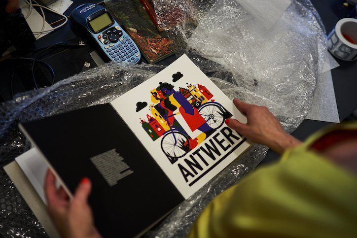
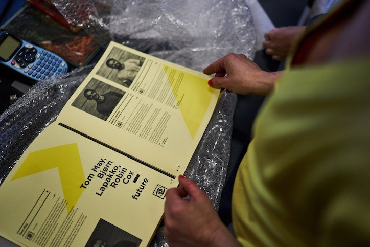
A beautiful art book. With it, This is Antwerp celebrated the fifth anniversary of D.A.T.E., an initiative that brings together a dozen or so creatives from around the world each year for an exploration of Antwerp’s artistic scene. Of all the photographers, artists, designers and bloggers who have already passed the review, twelve were invited again in 2019. They compiled their impressions into an exclusive coffee table book: 160 pages of photography, illustrations, interviews and notes form an extraordinary representation of Antwerp as a creative city.


D.A.T.E. art book according to four themes
For this anniversary edition, the twelve dove even deeper into the local scene, far off the beaten path. From Monday to Thursday they went out during the day, in the evening they met to translate their impressions into the pages for the D.A.T.E. art book. For this, they were split into four teams according to a well-defined theme: design, art, technology & innovation and subcultures. Those themes are the common thread throughout the book. “We spent four evenings and nights working on the book,” says graphic designer An Eisendrath, who handled the overall design and prepared the supplied material for printing. “The result is a wonderful collector’s item that uniquely captures all the experiences, impressions, stories and encounters in words and images.”
Creative solutions within timing and budget
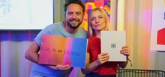
In late September, the book was presented at the creative event Us By Night. The cover consists of a simple gray cardboard. At the front is the logo of D.A.T.E. incorporated in black foil, at the back that of This is Antwerp. The effect is minimalist yet nuanced. Two completely different papers were chosen for the interior. The intro pages were printed in black and white on yellow uncoated paper, while the work of the 12 participants comes to life on a white fully-coated version. But what especially gives the book its artistic character is the open binding in which yellow once again takes a prominent role.


“Working out the book has been an intense process,” says An Eisendrath. “We were on tight timing and a limited budget. In addition, we had some very specific requirements that turned out to be far from obvious. The way solutions were sought to make everything rhyme perfectly is exceptional. The end result is beautiful, but first and foremost I keep a very personal feeling from this collaboration. The commitment and dedication of someone like your print expert Valérie is rare. I have never worked with a printing company that was so close to design. Every aspect has been considered. Each question was rooted for until there was an appropriate answer. Such a follow-up: chapeau.”


